Healthcare
From service design to visual storytelling, I transform ideas, systems, and information into experiences people can understand, navigate, and feel.Sometimes that's a workshop. Sometimes a healthcare system, a travel service, embroidery, packaging, and whatever challenge comes next.
Designing thoughtful visual communication that turns ideas into clear, memorable and engaging experiences across identities, campaigns and physical touchpoints.
Healthcare
Fashion · Craft · Personalisation
Sports · Sustainability
Publishing · Education · Interactive Media
Travel · Wellbeing · Experience Design
Travel · Tourism
Healthcare · Public Sector
Retail · Organisational Transformation
Jewellery · Fashion · E-commerce
Healthcare
Travel · Tourism



"Great design is not just about aesthetics, it's about creating meaningful experiences."
I thrive in collaborative environments where different perspectives lead to better ideas. Curious, proactive, and detail-oriented, I enjoy exploring new ways of thinking and turning complexity into clarity through both strategy and visual communication.
My MSc in Service Systems Design, shaped the way I approach complex challenges through research, strategy, and visual storytelling. Today, I combine systems thinking with visual design to create work that is not only engaging, but purposeful, intuitive, and grounded in real user needs.
Due to confidentiality agreements, a significant portion of the projects contributed to cannot be publicly displayed.
Selected details can be discussed upon request.
Let's look beneath the surface, question the familiar,
and find a direction that feels clear and meaningful.
A multisensory storytelling experience where editorial design meets animation, interaction and sound.
“How might editorial design evolve beyond the printed page to create a richer, multisensory storytelling experience?”
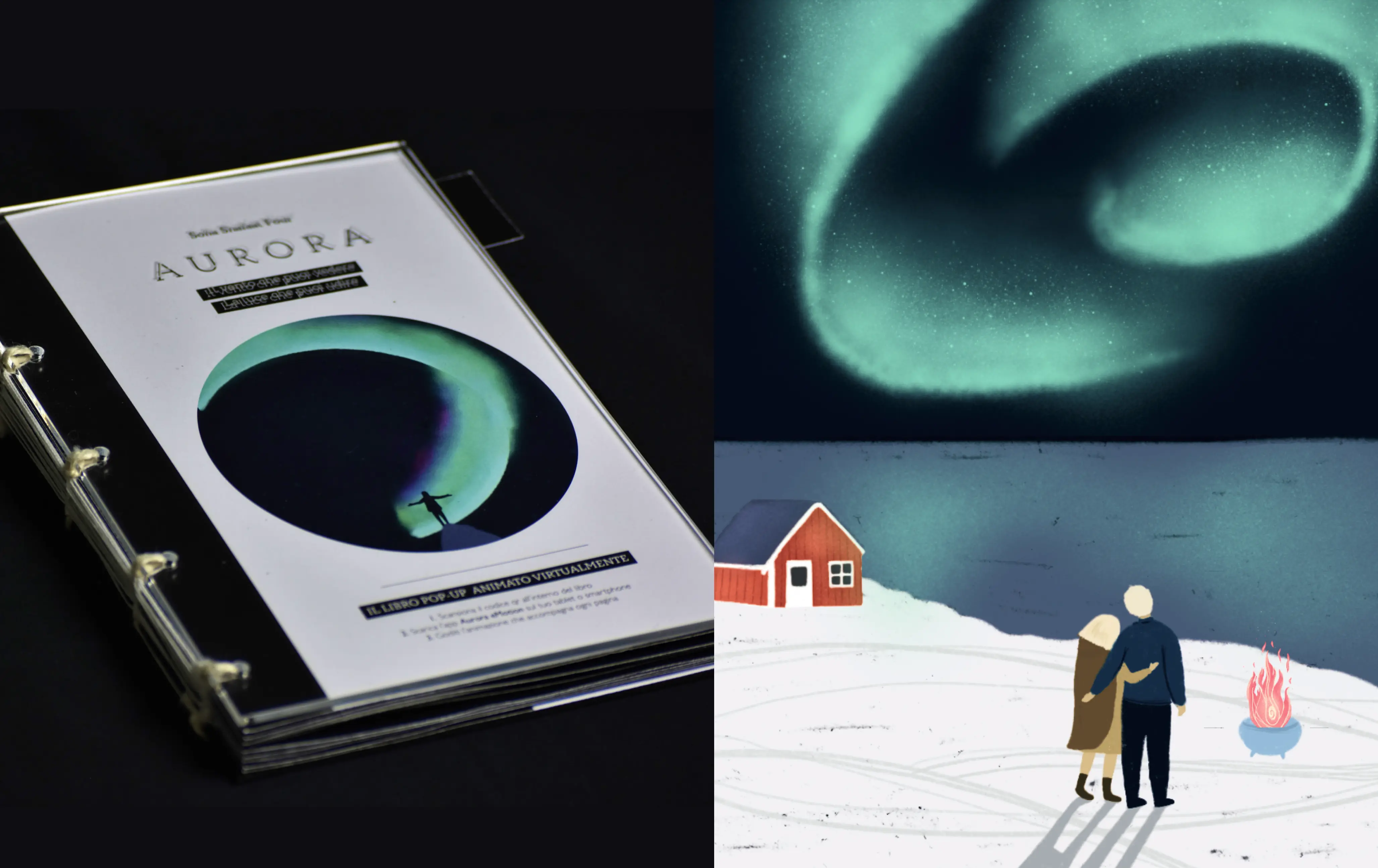
Aurora is an experimental editorial project inspired by the Northern Lights and Nordic folklore. Through a combination of printed pop-up structures, hand-drawn animations and sound, the book transforms reading into an immersive experience where every page can be seen, touched and heard.
Traditional books engage primarily through text and static imagery. The challenge was to preserve the intimacy of printed storytelling while expanding it into a more immersive and emotionally engaging experience without losing narrative clarity.
I designed an interactive pop-up book where each physical scene is paired with a hand-drawn animation, creating a continuous dialogue between print and digital media. The narrative was built around the unique paradox of the Aurora Borealis, the only wind you can see and hear, using movement, sound and tactile interactions to reinforce the emotional journey of the story.
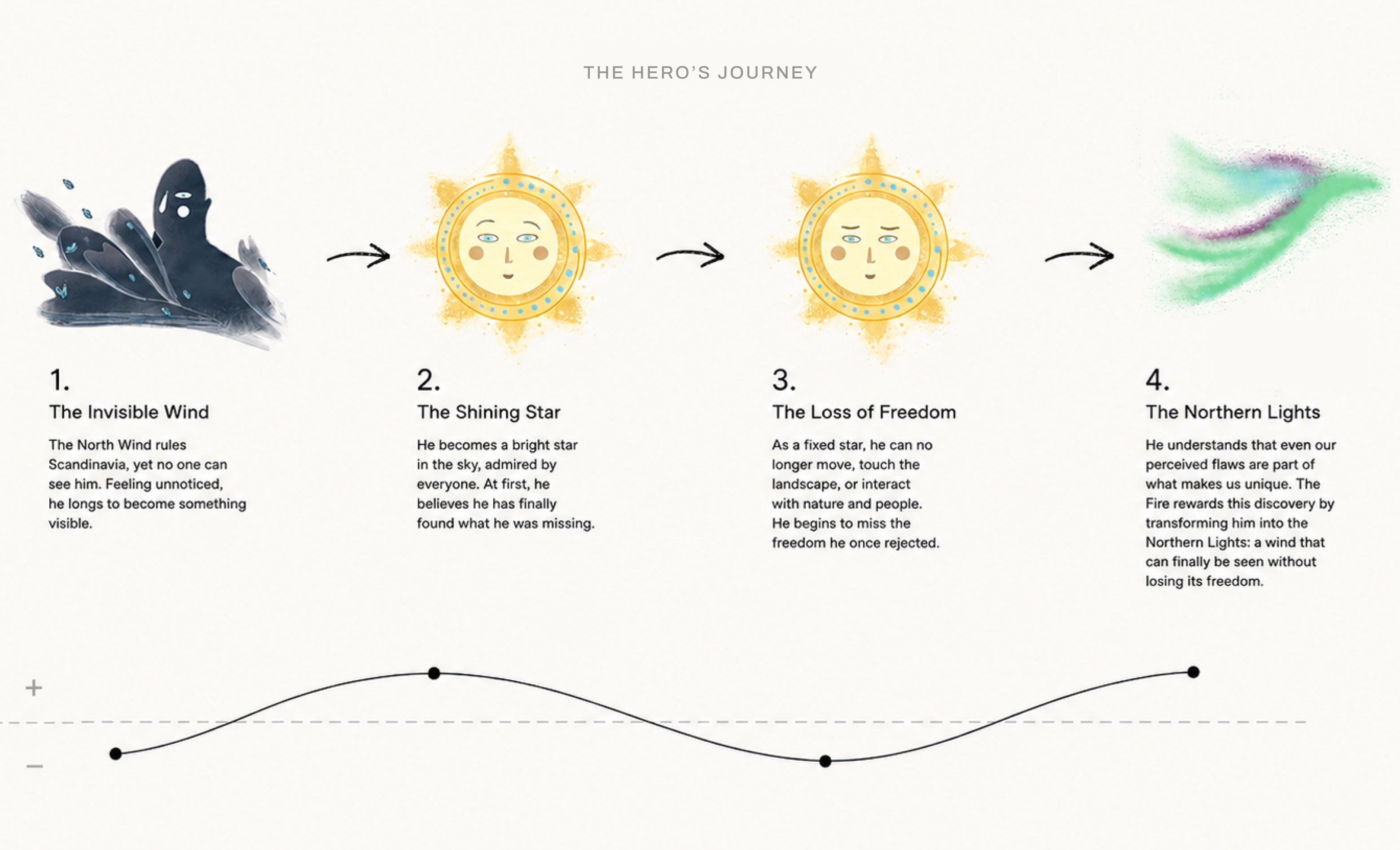
The story follows the Nordic Wind, who longs to become a star so he can finally be seen. Through his journey, he discovers that true beauty comes from embracing both strengths and imperfections, ultimately transforming into the Aurora Borealis.

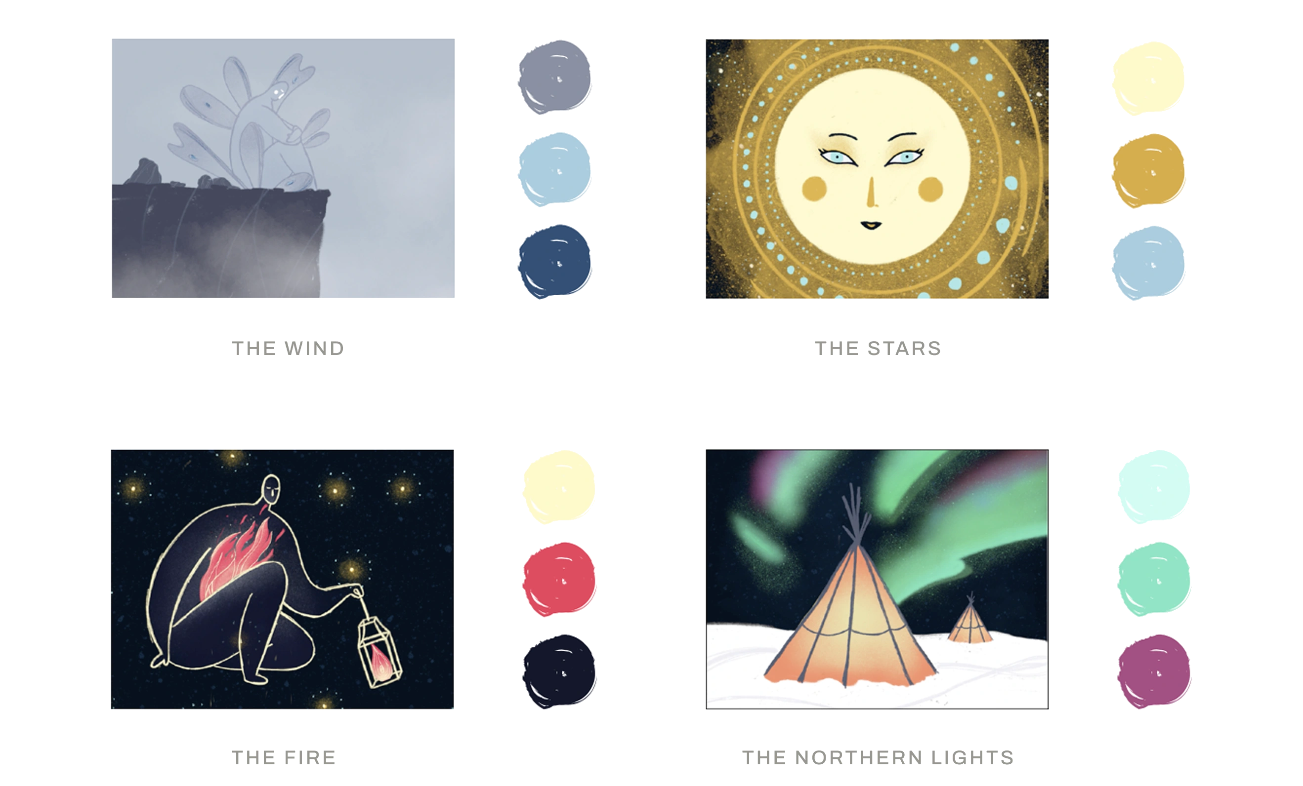
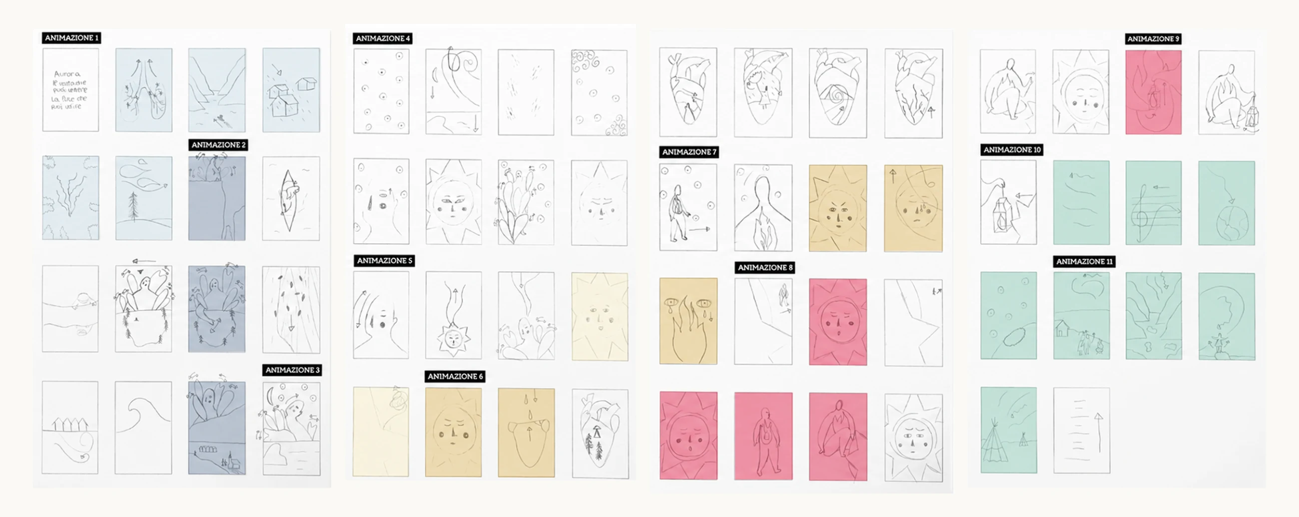
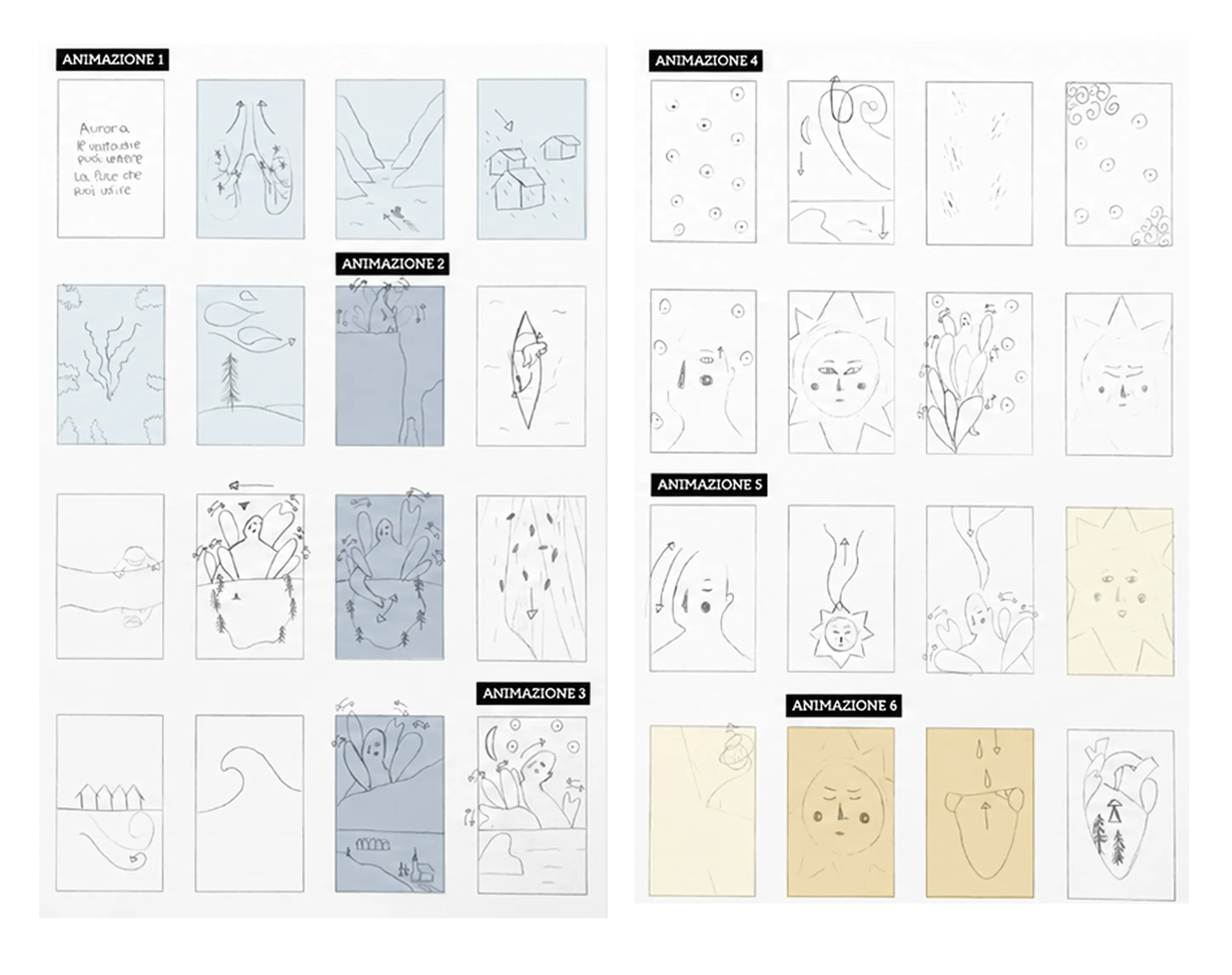
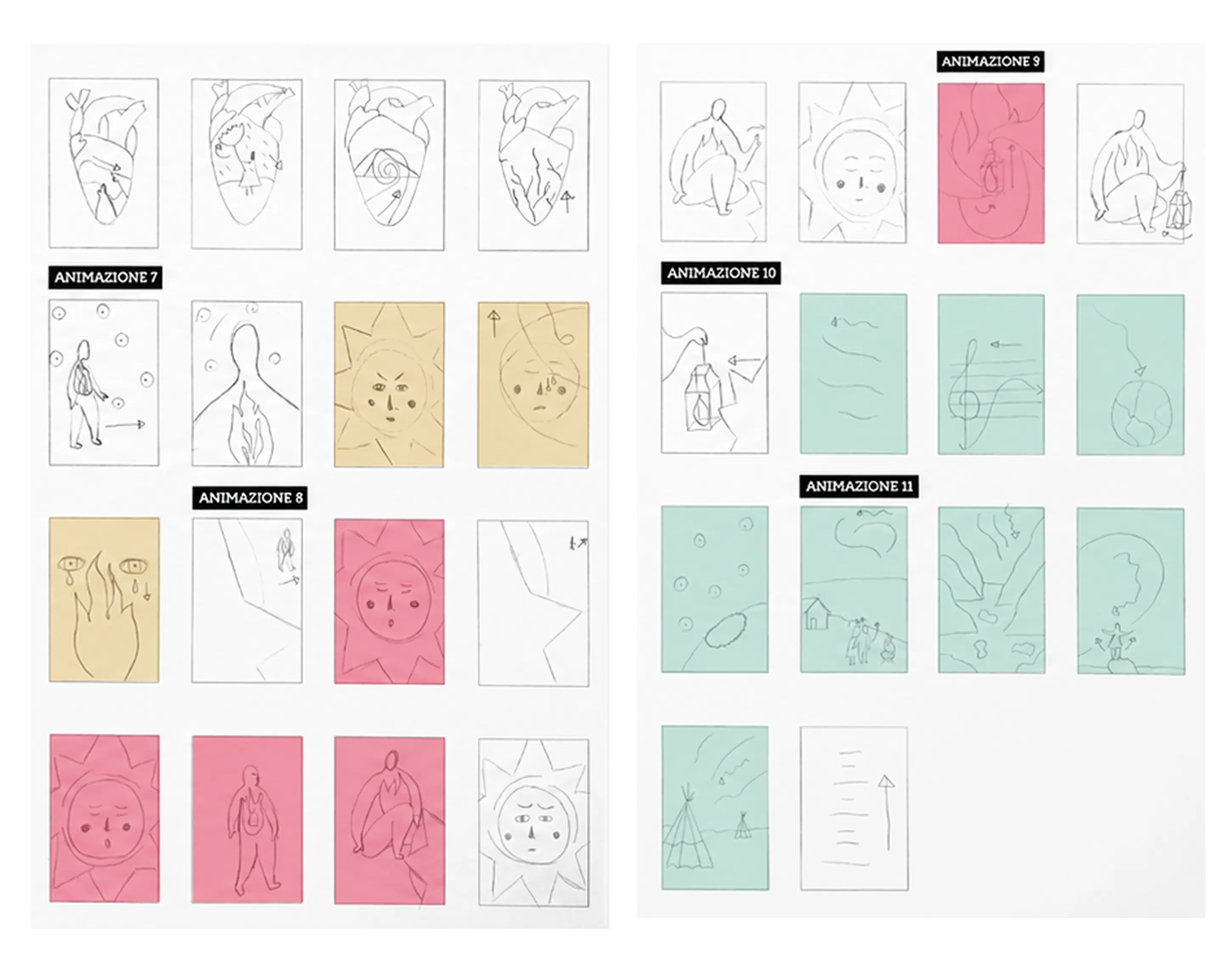
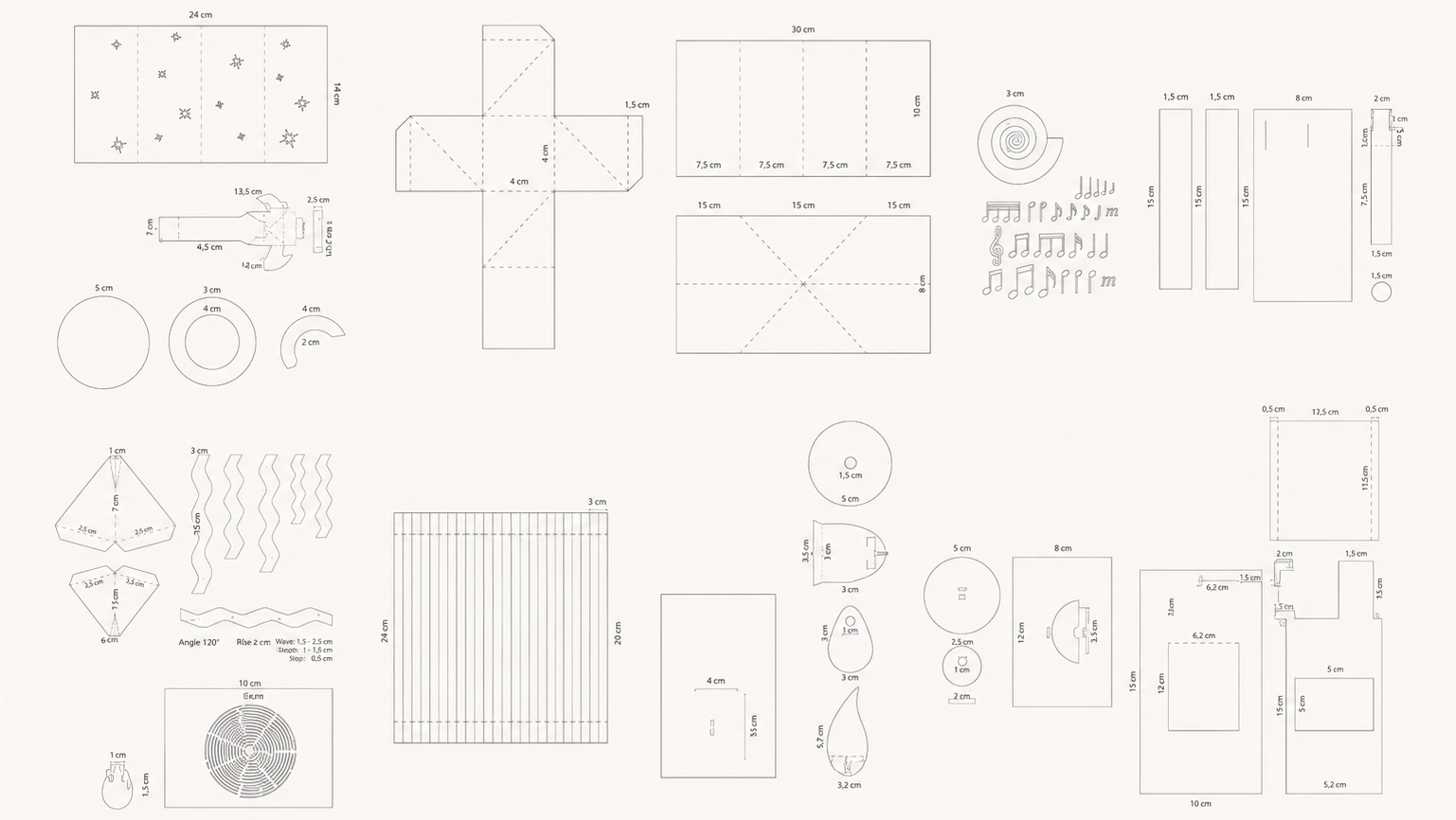


The project demonstrated how physical and digital media can work together to expand editorial storytelling into a more immersive and emotionally engaging experience. The final prototype successfully combined illustration, pop-up design, animation, sound, and interaction within one coherent narrative.
Its strongest validation came from the audience response: adults were visibly moved by the story, and children remained curious and deeply engaged. This showed that the experience could connect across age groups and translate a complex emotional message into an accessible, memorable format.
Designing a scalable storytelling system for client success stories.
*Content redacted due to confidentiality.
“How might we transform past projects successes into a narrative that communicates the value and evolution
of a long-term client partnership?”
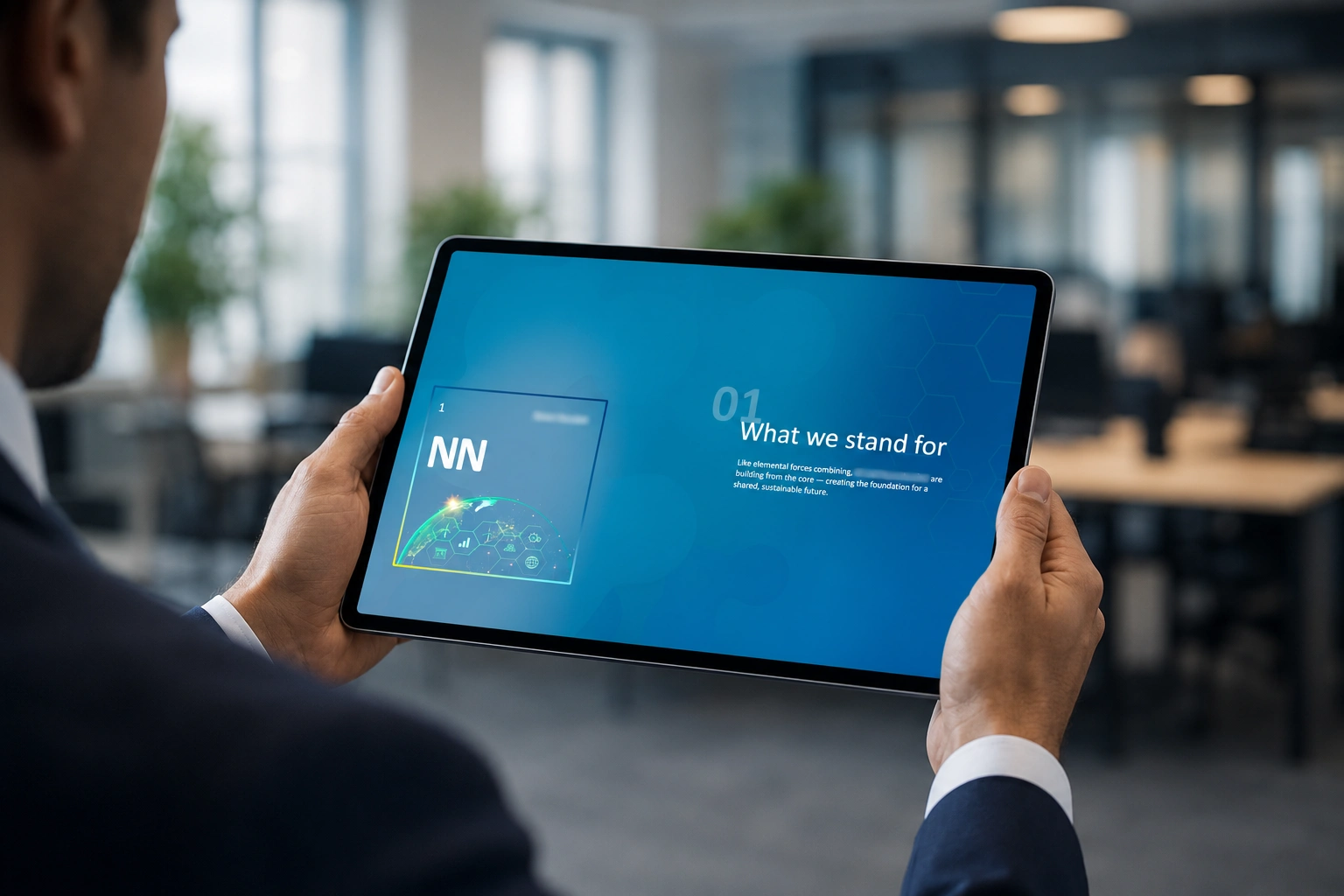
This presentation framework communicates the success stories of collaborative projects between a Big 4 consultancy and one of the leading Nordic pharmaceutical companies to help consultants present past achievements consistently while reinforcing the long-term value of the partnership.
Consultants lacked an engaging way to connect fragmented projects and communicate the partnership’s strategic value over time. The framework also needed to remain reusable across future healthcare clients.
I analysed and restructured the existing material into three connected chapters: shared ambitions, partnership highlights, and achievements. To make the progression immediately visible, I developed a molecular-bond metaphor using microscopic imagery. As the presentation unfolds, two molecules gradually connect into a stronger structure, reflecting the evolving relationship between the organisations. The metaphor became a strategic storytelling system that guided the content structure, imagery, and transitions while remaining adaptable to other healthcare brands.
The framework was presented to the consulting team and recognised for turning disconnected case studies into a coherent and engaging business narrative.
It also created a reusable knowledge-sharing asset, making successful projects easier to document, communicate, and leverage internally and externally. By providing clearer evidence of long-term client impact, the template also supports future business development.
“The narrative creates a much stronger business case for our work. It connects projects that previously stood alone and communicates the partnership in a way that’s clear, engaging, and scalable.”The consultants account team
Designing an adaptive travel planning service that transforms information overload into confident, collaborative decisions.
Methods: Desk Research · Surveys · Personas · Journey Mapping · Stakeholder Mapping · Co-creation · Prioritisation Matrix · Service Blueprint · User Testing & validation
Team: Jacob Szøts (Back-end development & AI) · Sofia Shafaat
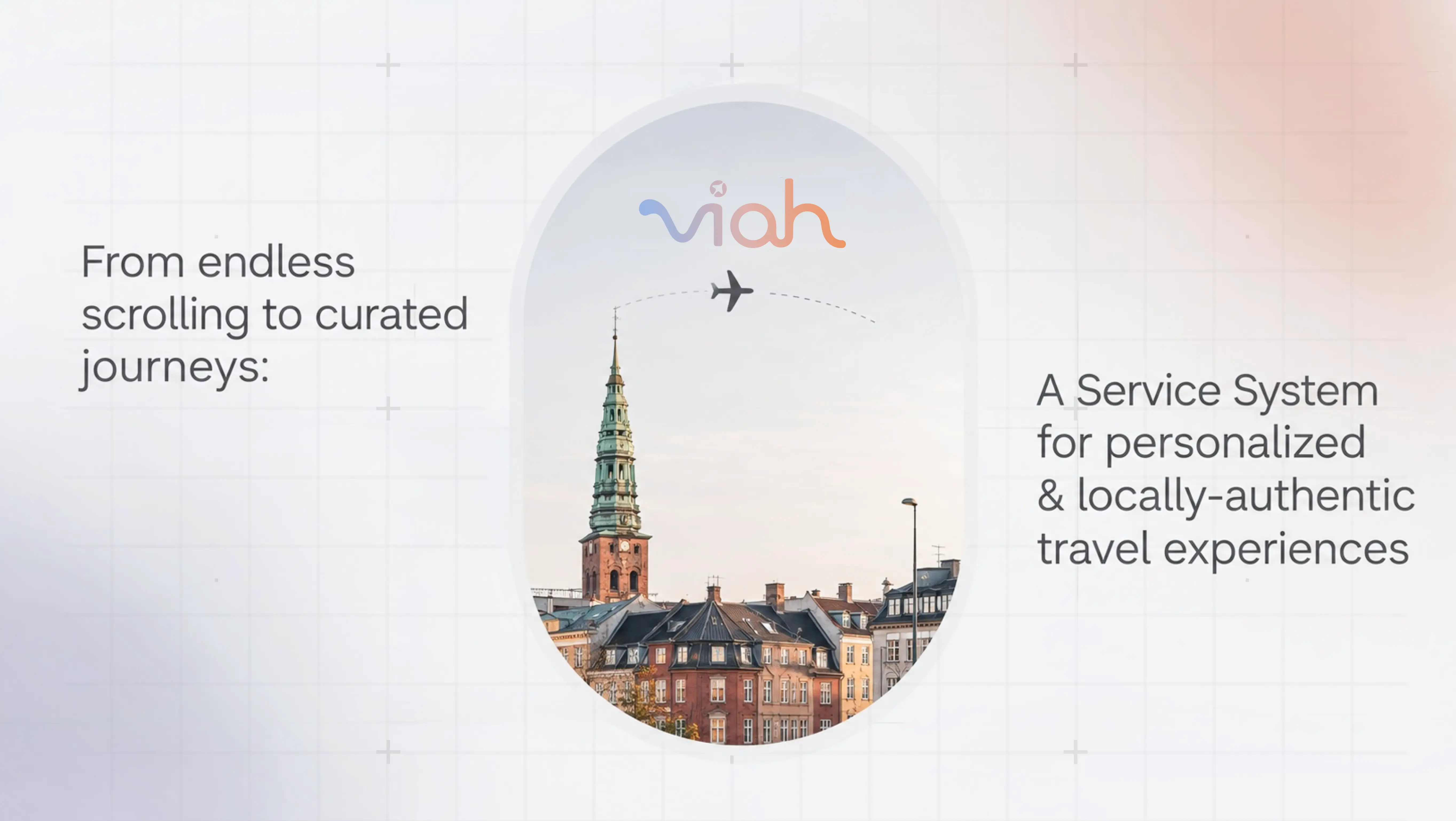
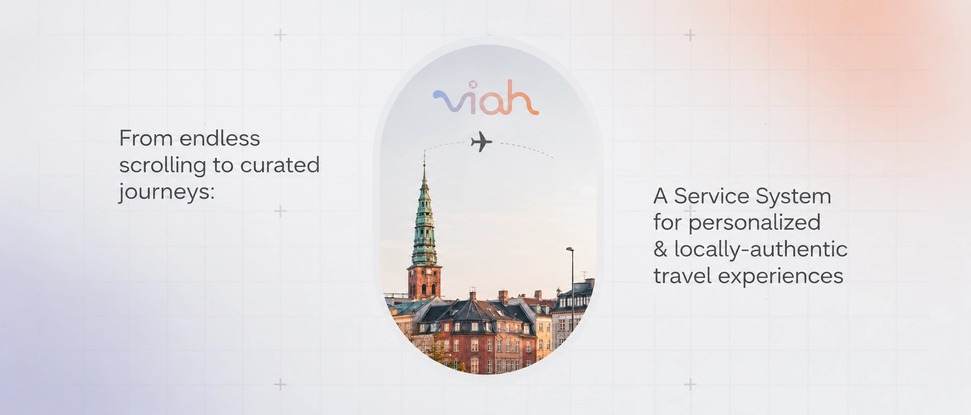
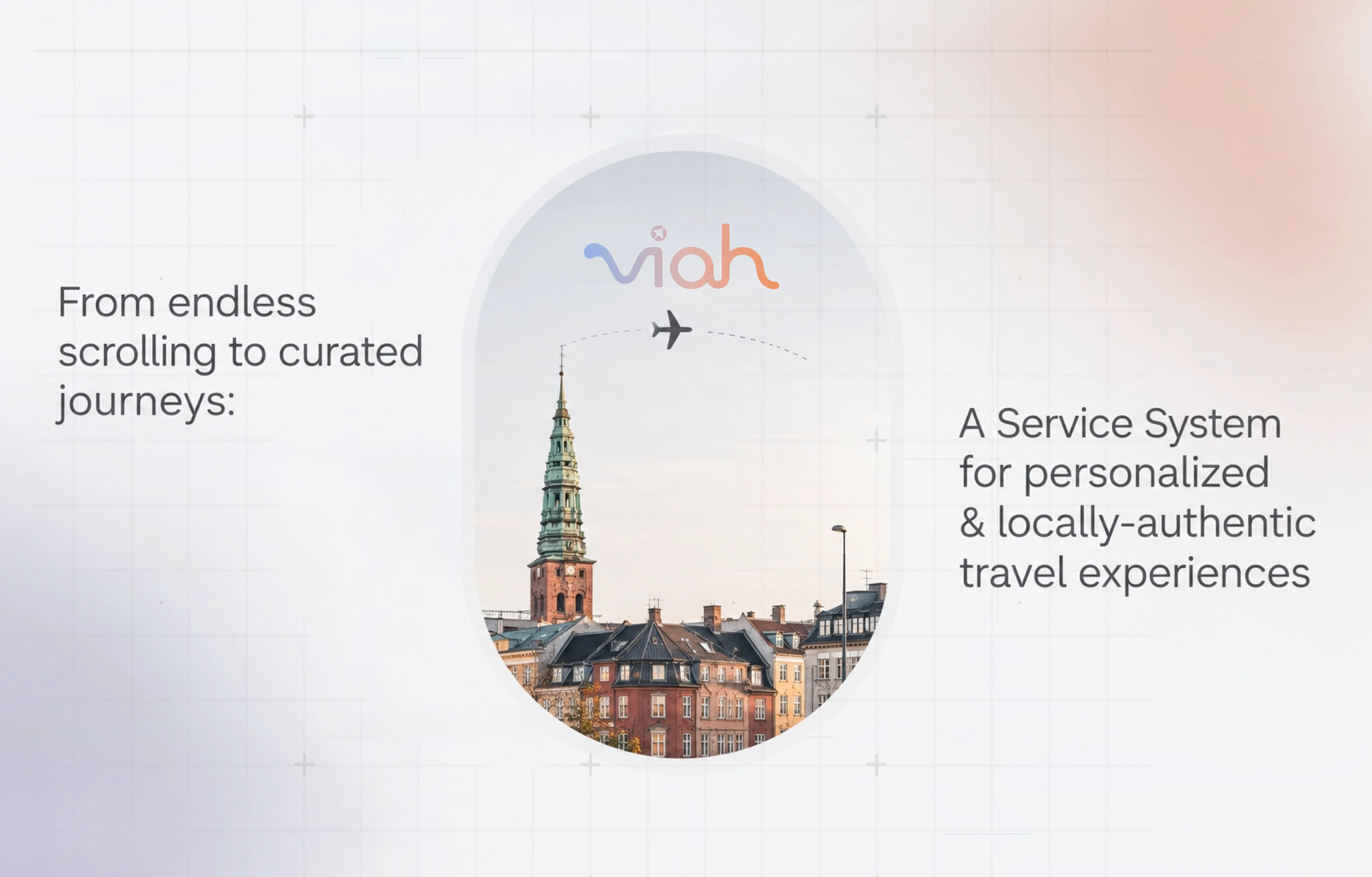
Viah is a travel ecosystem bringing together travellers, citizens, local experience providers and tourism organisations.
Travel planning is fragmented across travellers, digital platforms, local businesses, and tourism organisations. Valuable information and local experiences exist across this network, but they are rarely connected in a seamless way that helps travellers make confident decisions or gives local providers meaningful visibility.
The challenge is not a lack of information, but disconnected knowledge and actors. Travellers need relevant guidance and personalisation, while local providers, citizens, and tourism organisations need better ways to share knowledge, connect with others and contribute to the destination.
The solution connects travellers, local providers, citizens and tourism organisations within one ecosystem. It combines personalised recommendations, collaborative planning and curated local experiences to create value across the network.

A digital service concept aimed at facilitating more personalised, locally-oriented, and non-mainstream tourism experiences while creating value exchanges between travellers, local providers, citizens and local tourism organisations.
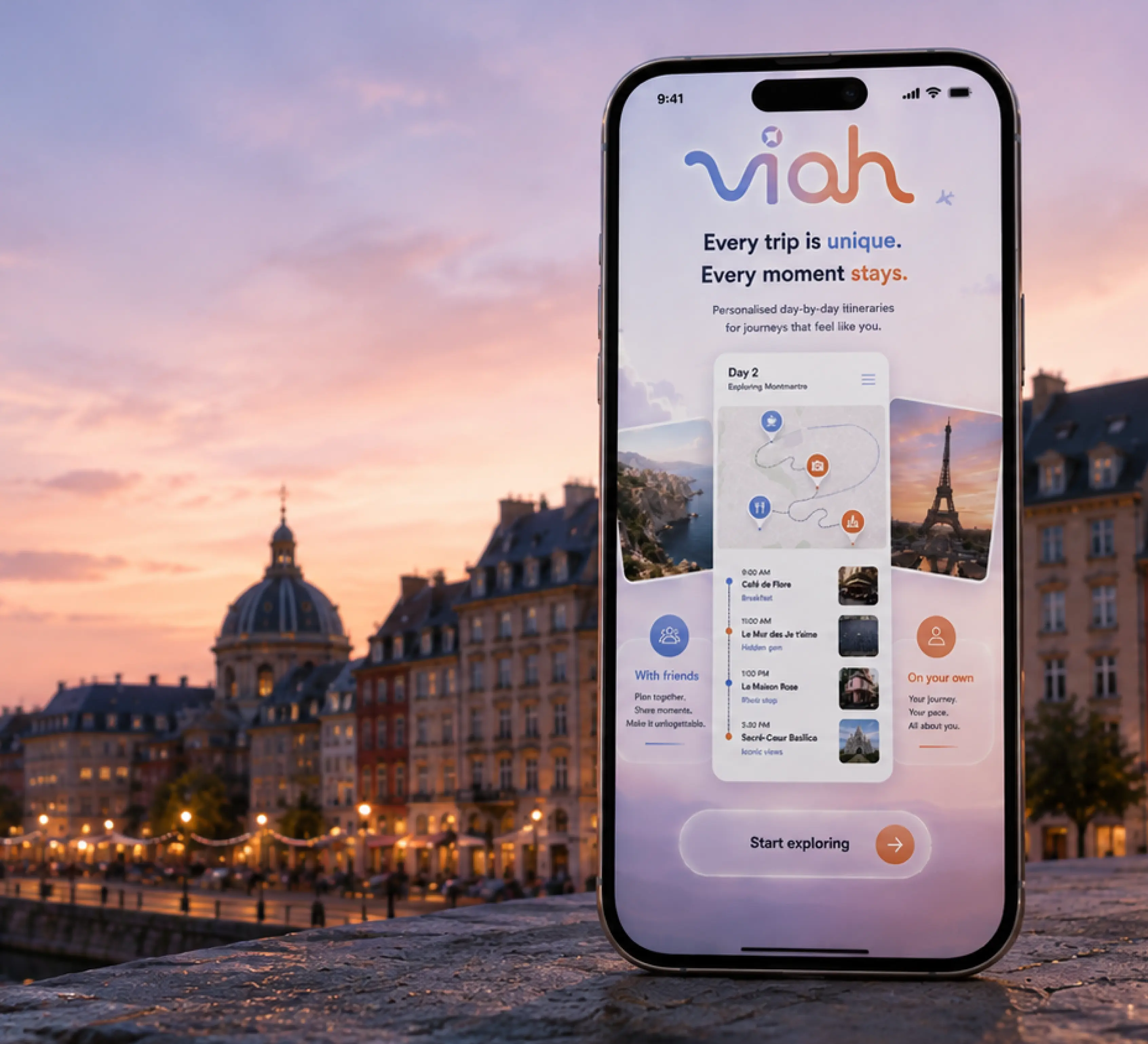
Planning a trip to a place you don’t know can quickly become overwhelming.
The more questions you have, the harder the decision becomes.
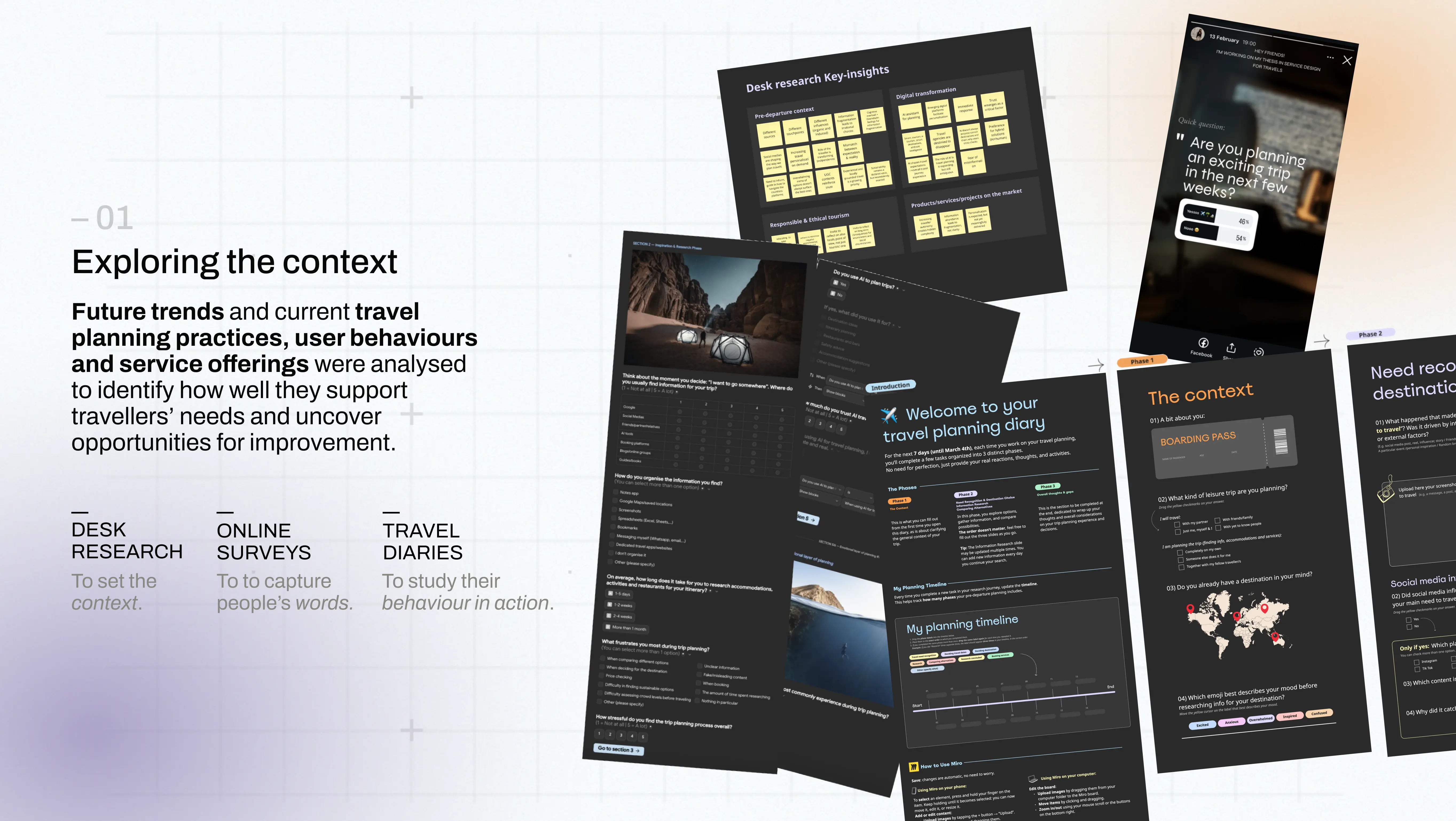
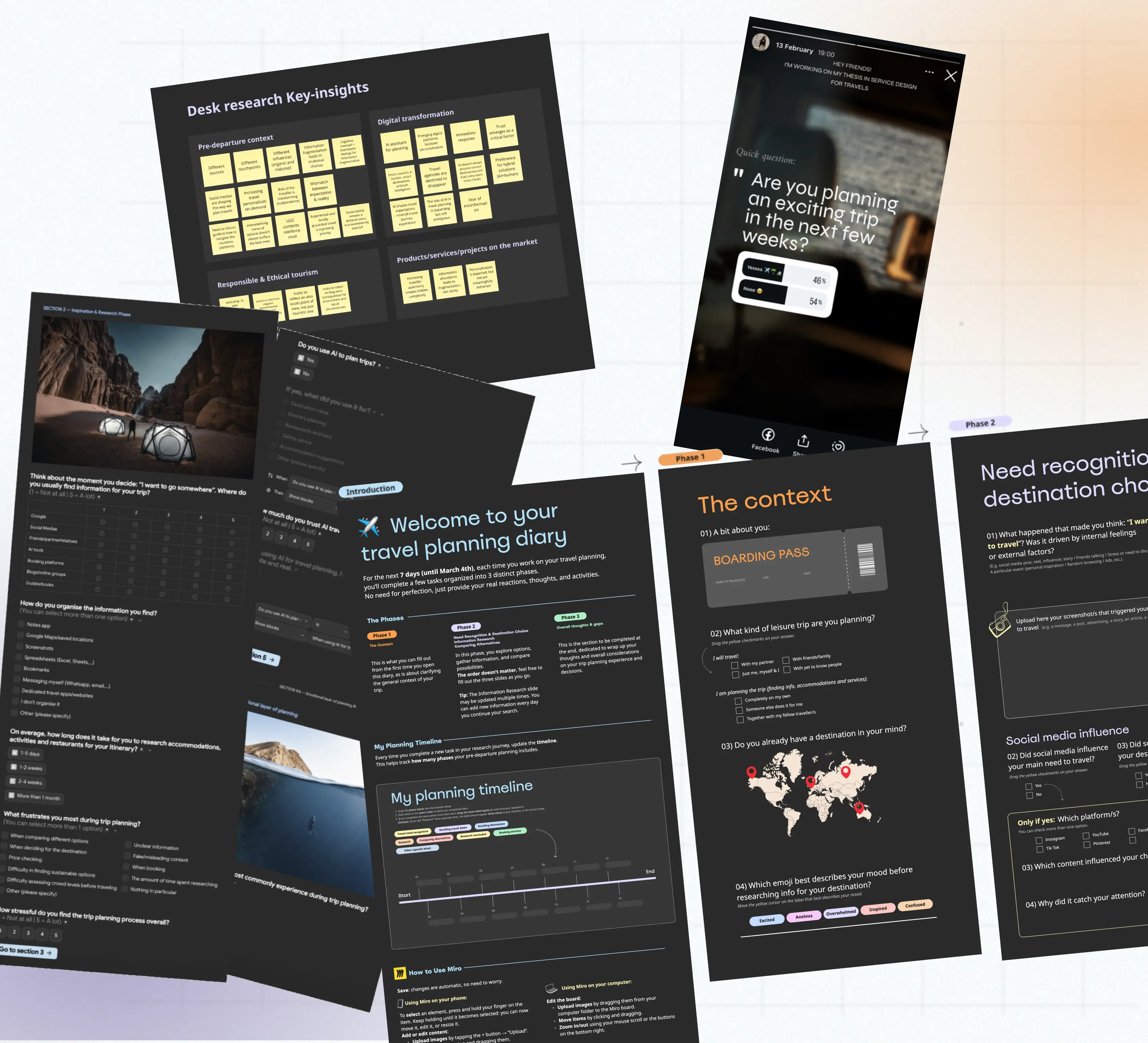
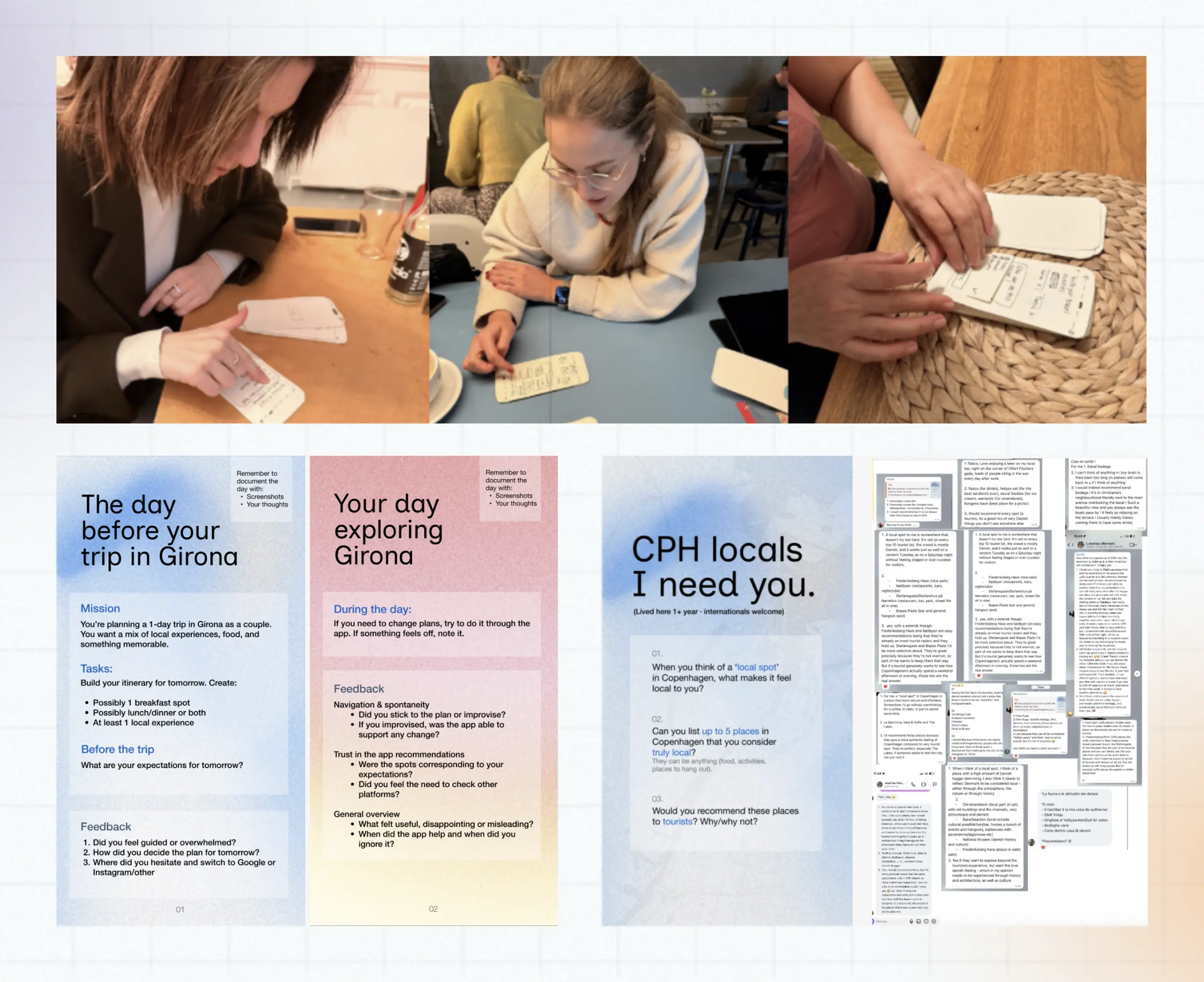
But how did I understand it?Let’s make a step back and have a look to the design process!

Information Overload
Travel platforms provide an abundance of information, but struggle to turn it into coherent, organised, and actionable choices.
Trust matters
Fragmented platforms and conflicting information make it difficult to know what to trust and confidently decide.
Local over mainstream
Travellers increasingly seek authentic, local experiences, but discovering them still requires extensive research.
Planning is non-linear
Plans constantly evolve with changing preferences, context and information, shaping an emotional journey from excitement to overwhelm to satisfaction.
These directions became the foundation for exploring different service concepts.
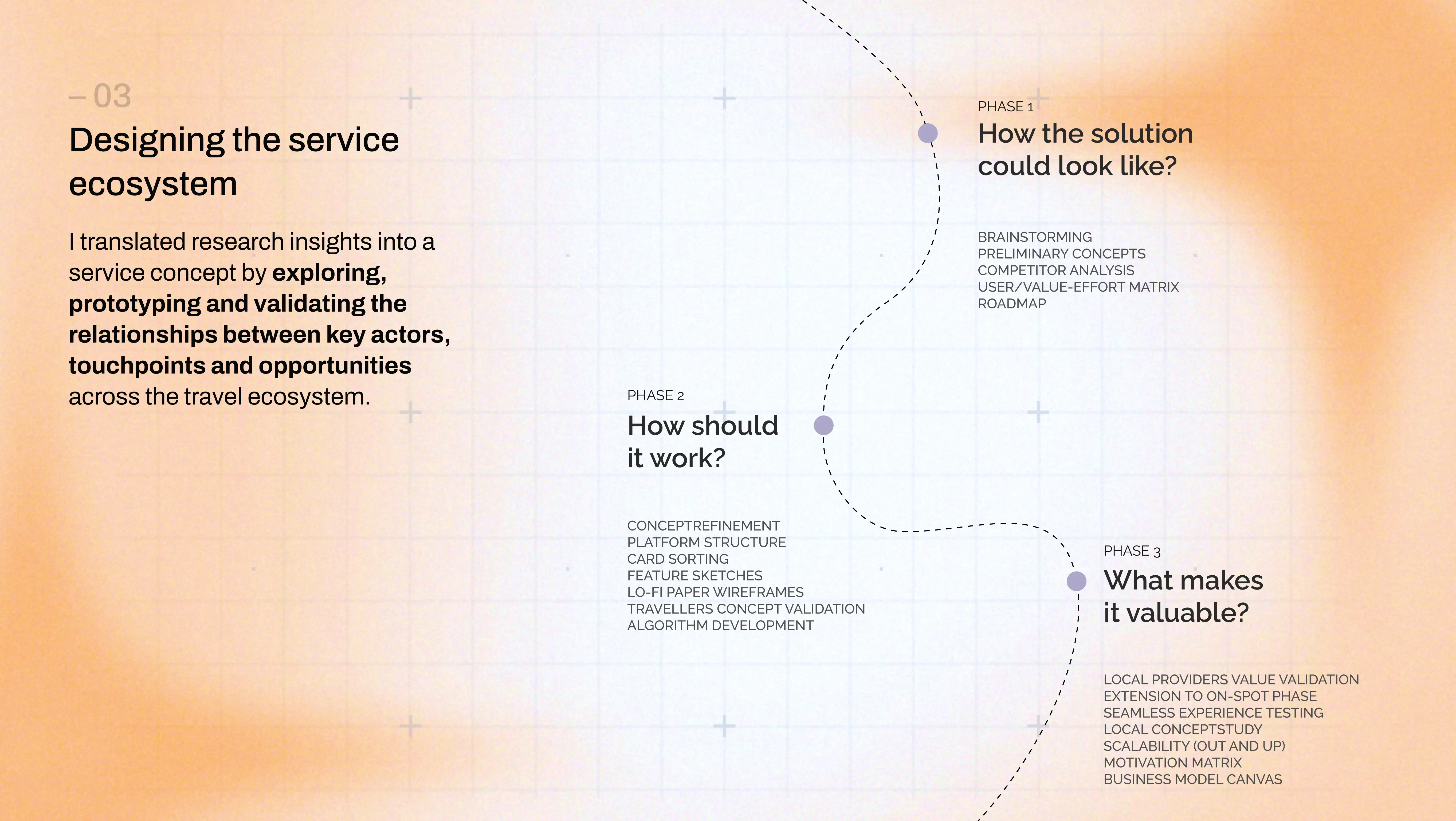
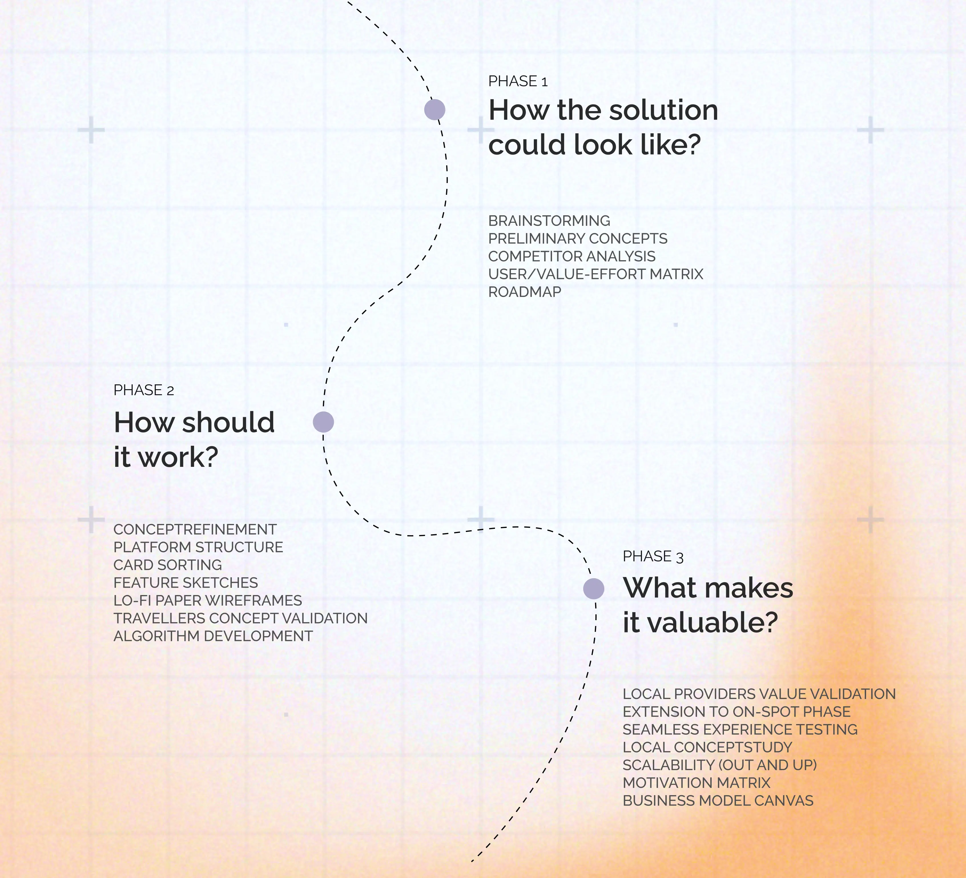
Ideation & filtering
Brainstormed solutions to key stakeholder challenges, then filtered ideas by feasibility and long-term potential.
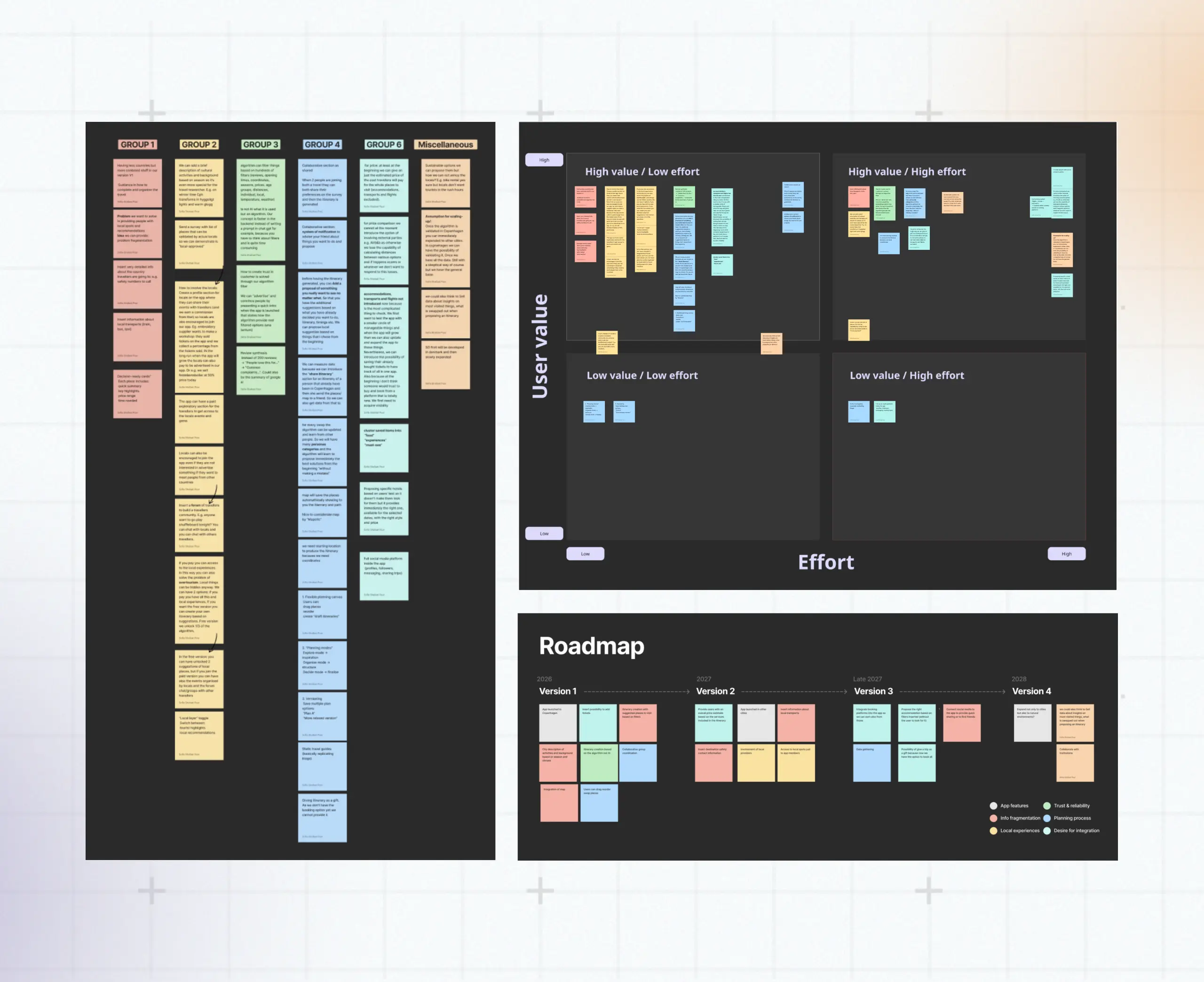
Concept exploration
Developed and compared service concepts, using competitor analysis to evaluate their value and potential within the wider travel industry.
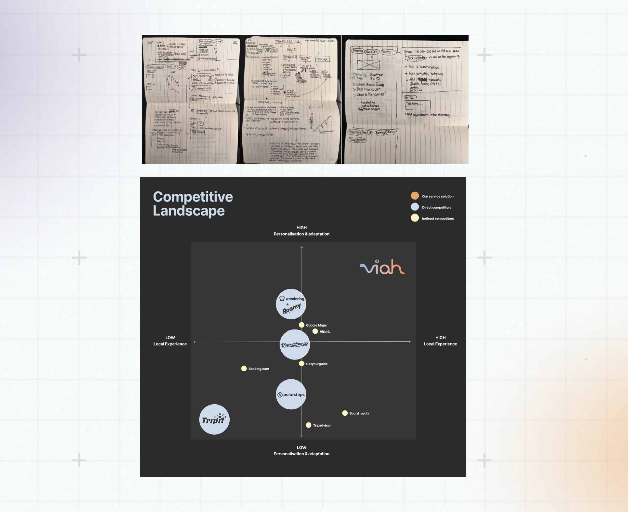
Prototyping
Made the service concept tangible through low-fidelity prototypes, exploring key interactions and service touchpoints.
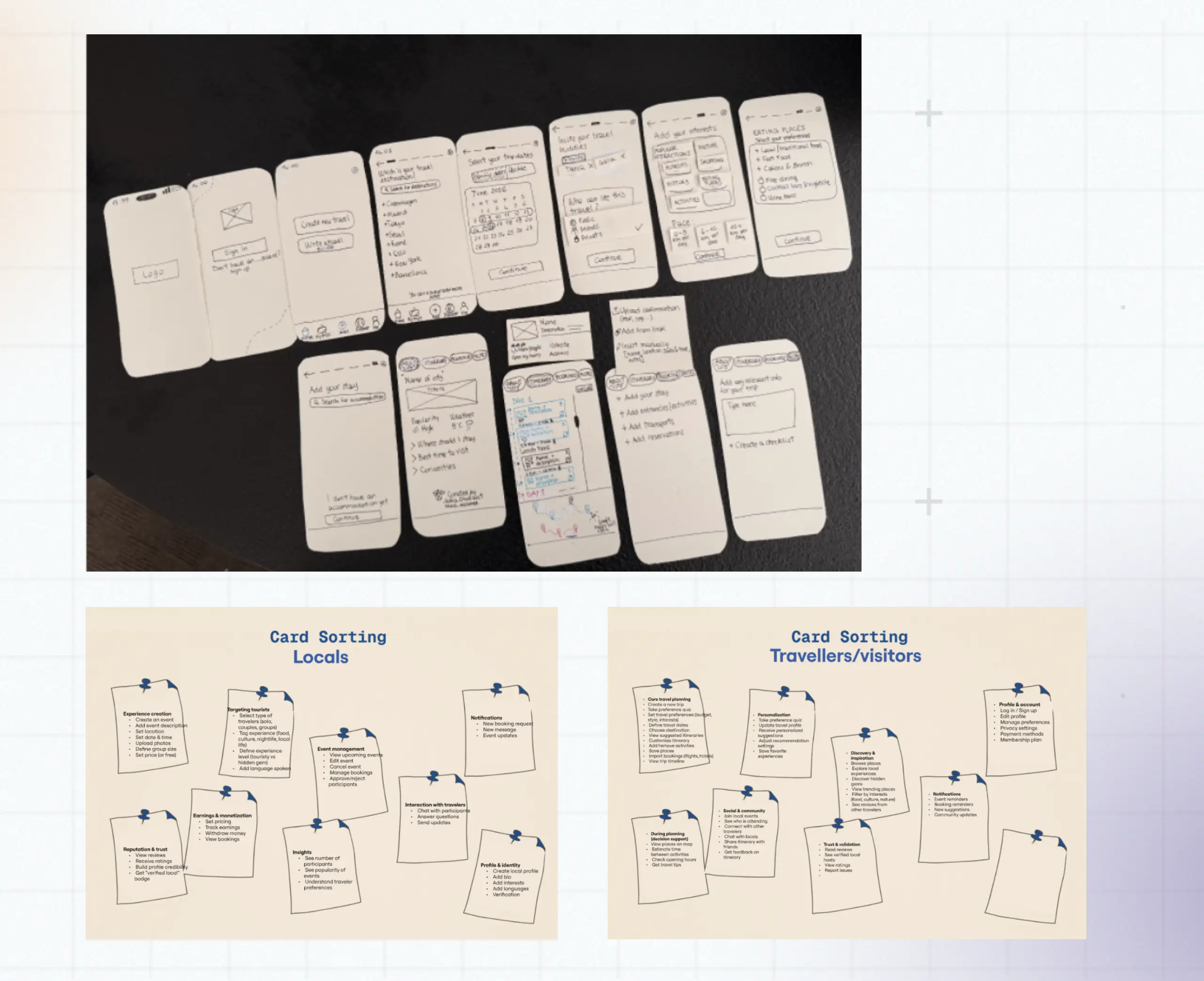
Testing & validation
Refined the concept through user interviews, real-life testing and validation with local experience providers.
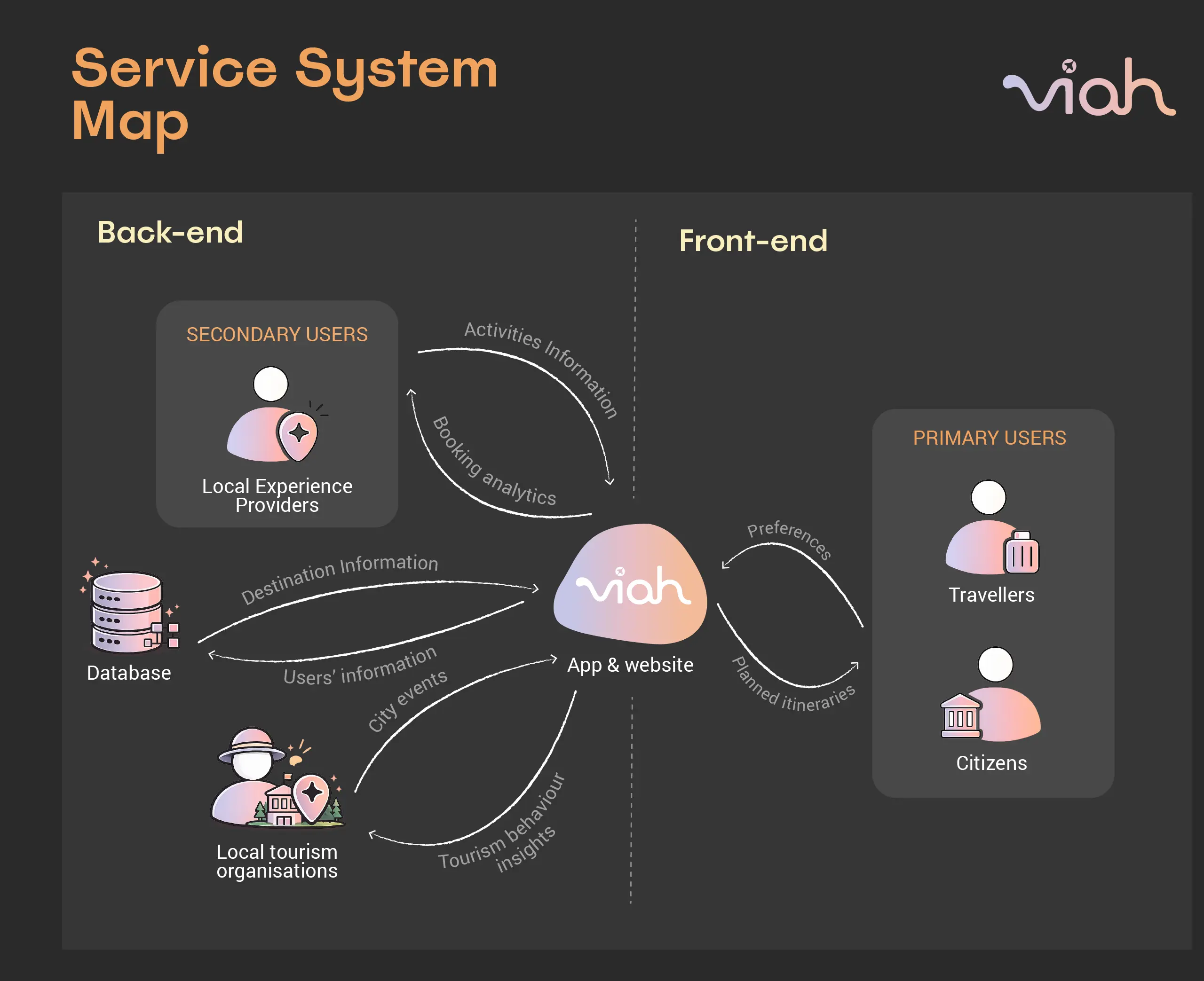
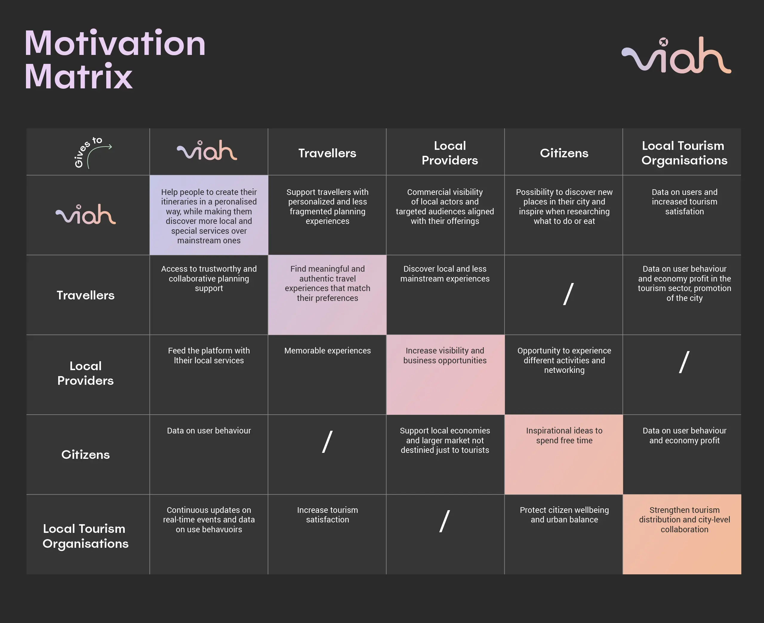
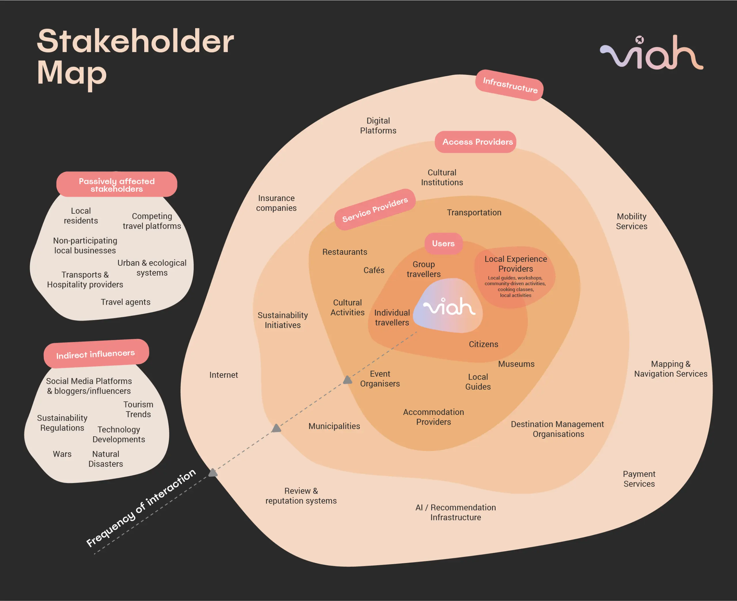
Travellers
Share preferences, discover and plan their trips
Viah
Orchestrates actors, relationships and value exchanges across the travel system
Local experience providers
Offer activities, places, local knowledge and opportunities to visitors
Citizens
Discover local providers, activities and places in their own city
Local tourism organisations
Gain insights into visitor interests, movement patterns and underexplored areas to support destination management
Viah’s algorithm
Connects data and preferences to generate personalised recommendations
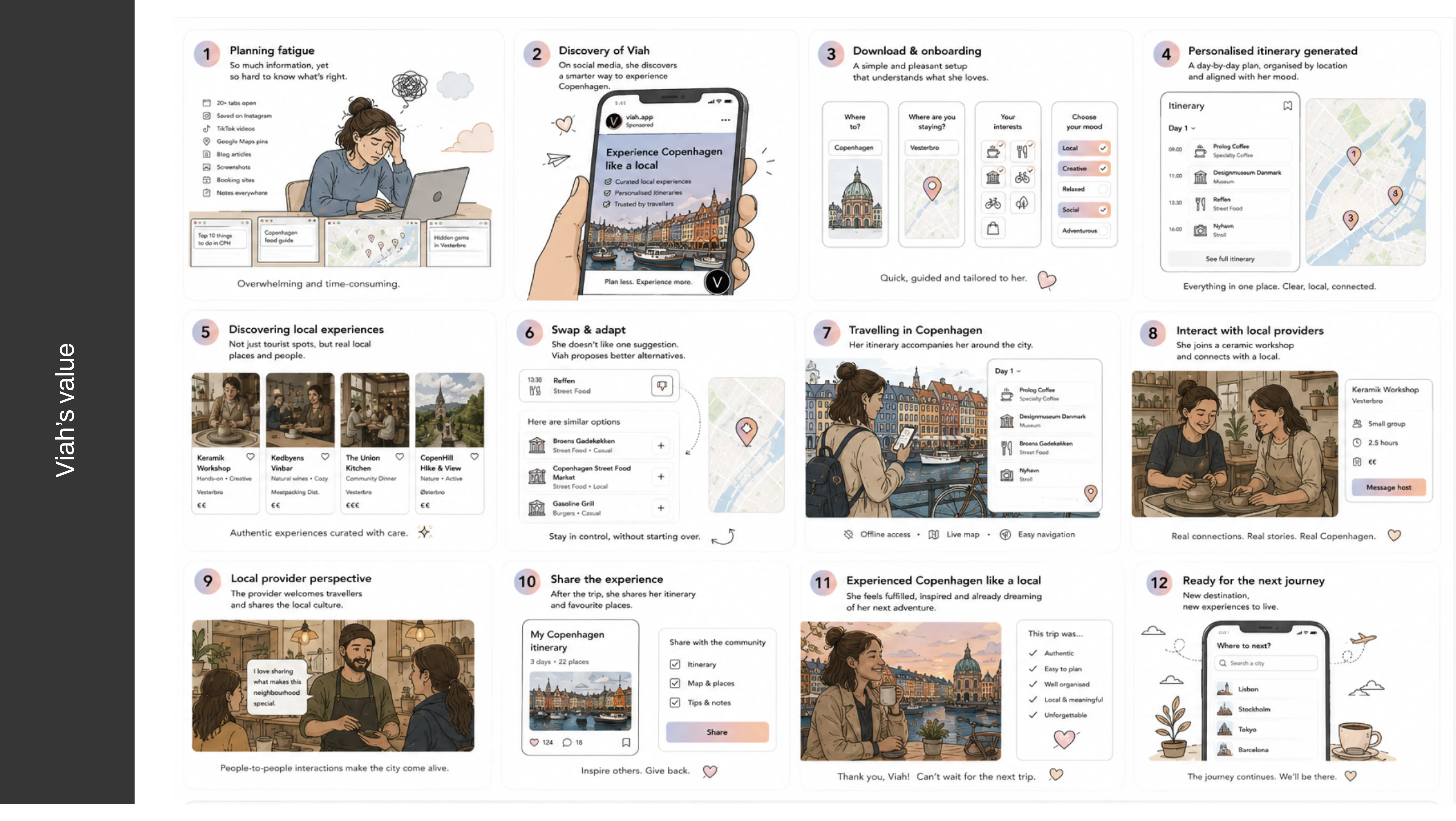
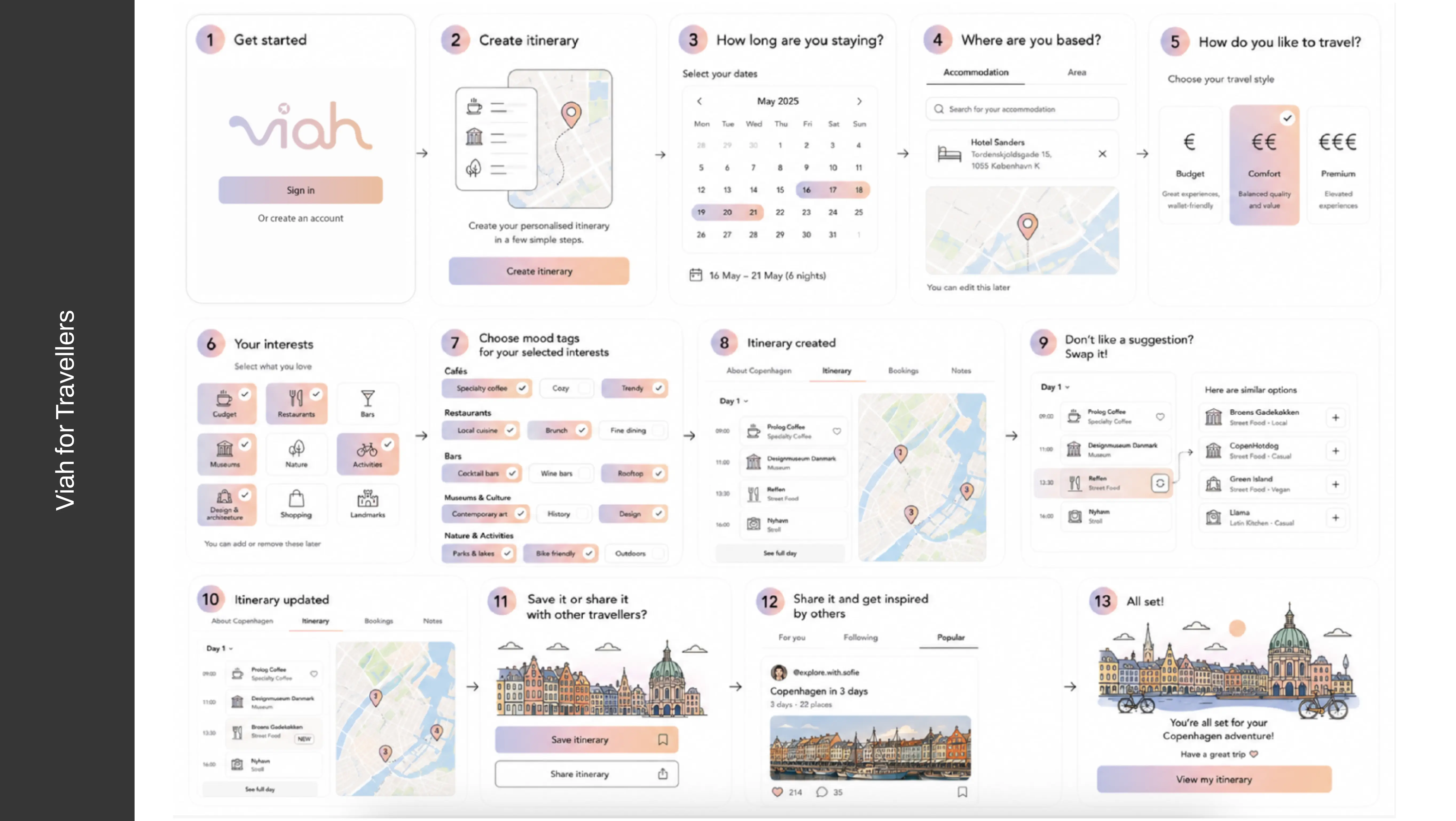
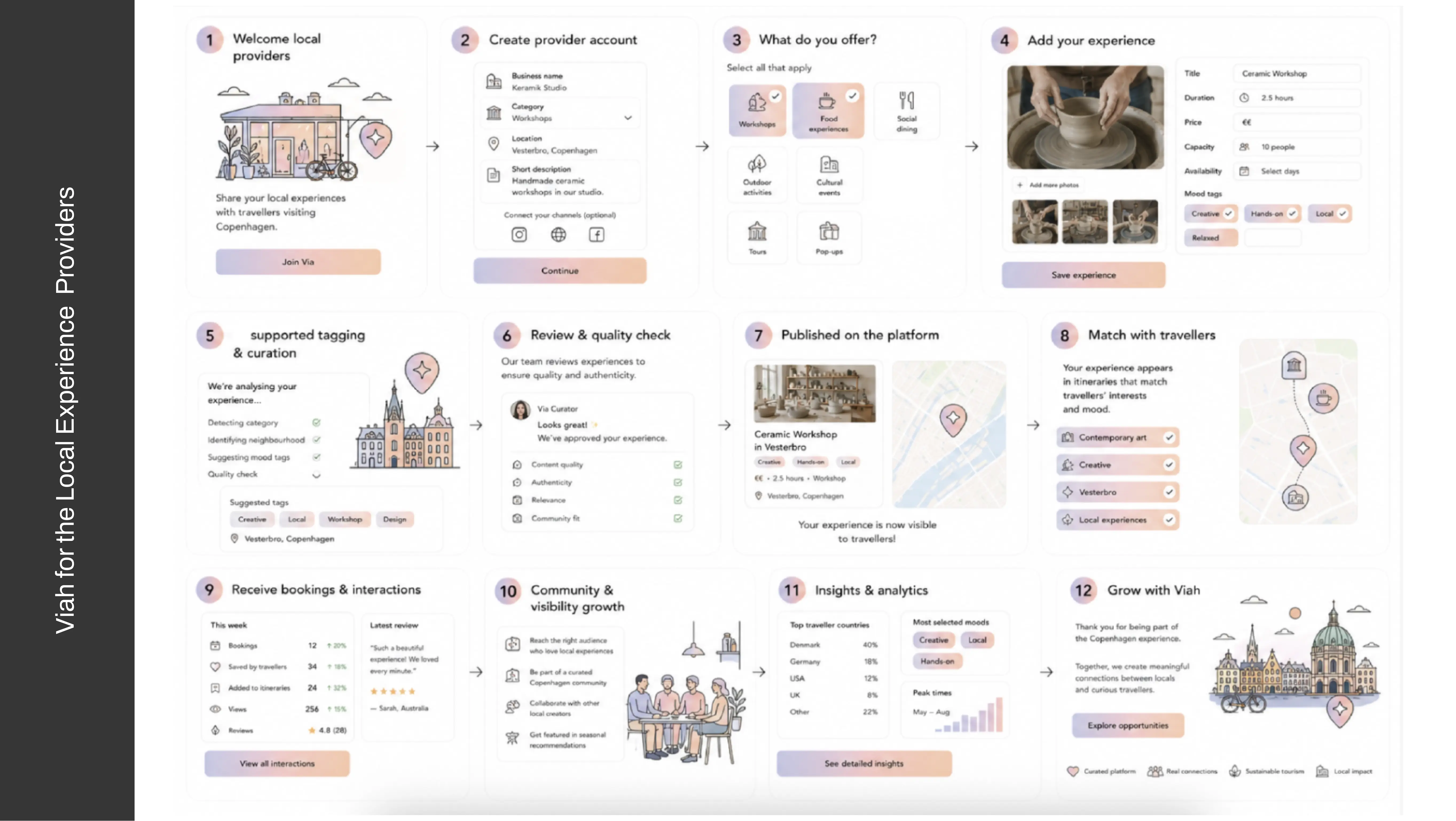
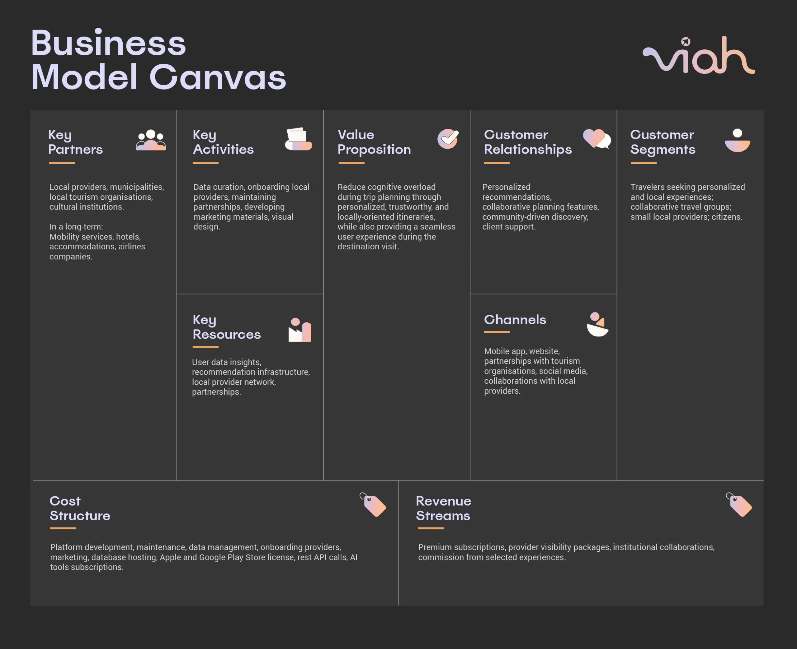
User testing and validation showed that travellers could move from exploring an unfamiliar destination to building a personalised itinerary without having to piece information together across multiple platforms. The experience was accessible to users across different age groups, including older participants, who were able to navigate the service with ease.
The outcome was a tested service concept that brings together personalised planning, destination and local experience discovery, and collaborative decision-making in one experience, while keeping users in control of their final decisions.
Designing a service that delivers the right information at the right moment to empower informed healthcare decisions.
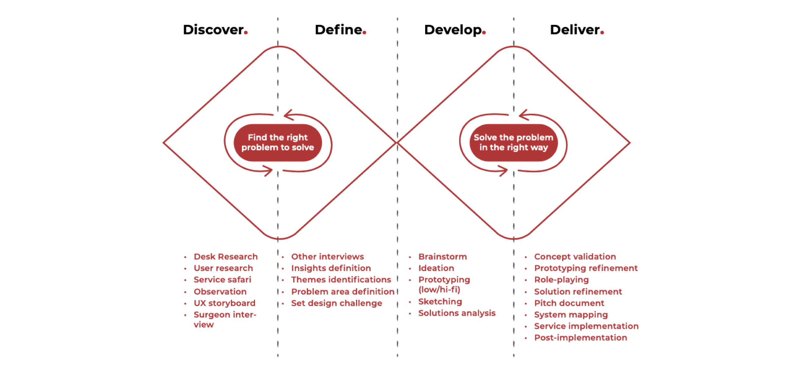
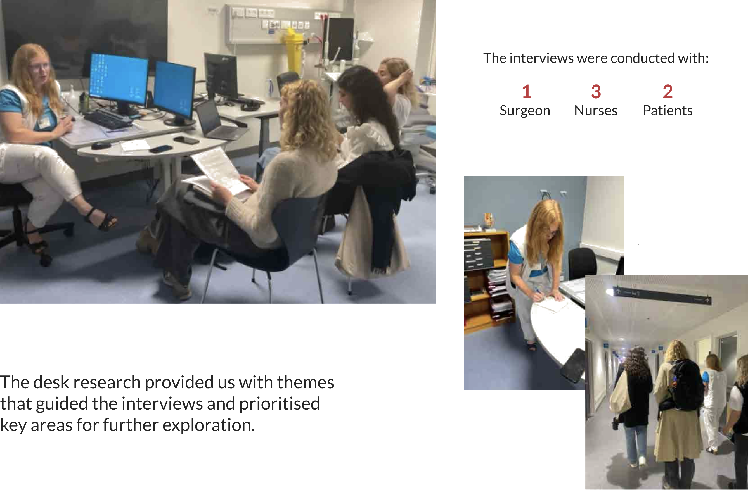
Methods: Desk Research · User Interviews · Observation · Service Safari · Journey Mapping · Co-creation · Prototyping · Concept Validation · Service Blueprint
Team: Agnete Heidensleben · Lucas Grattan Landberg · Nina Sara Joachimowska · Samira Aliverdipour · Sofia Shafaat
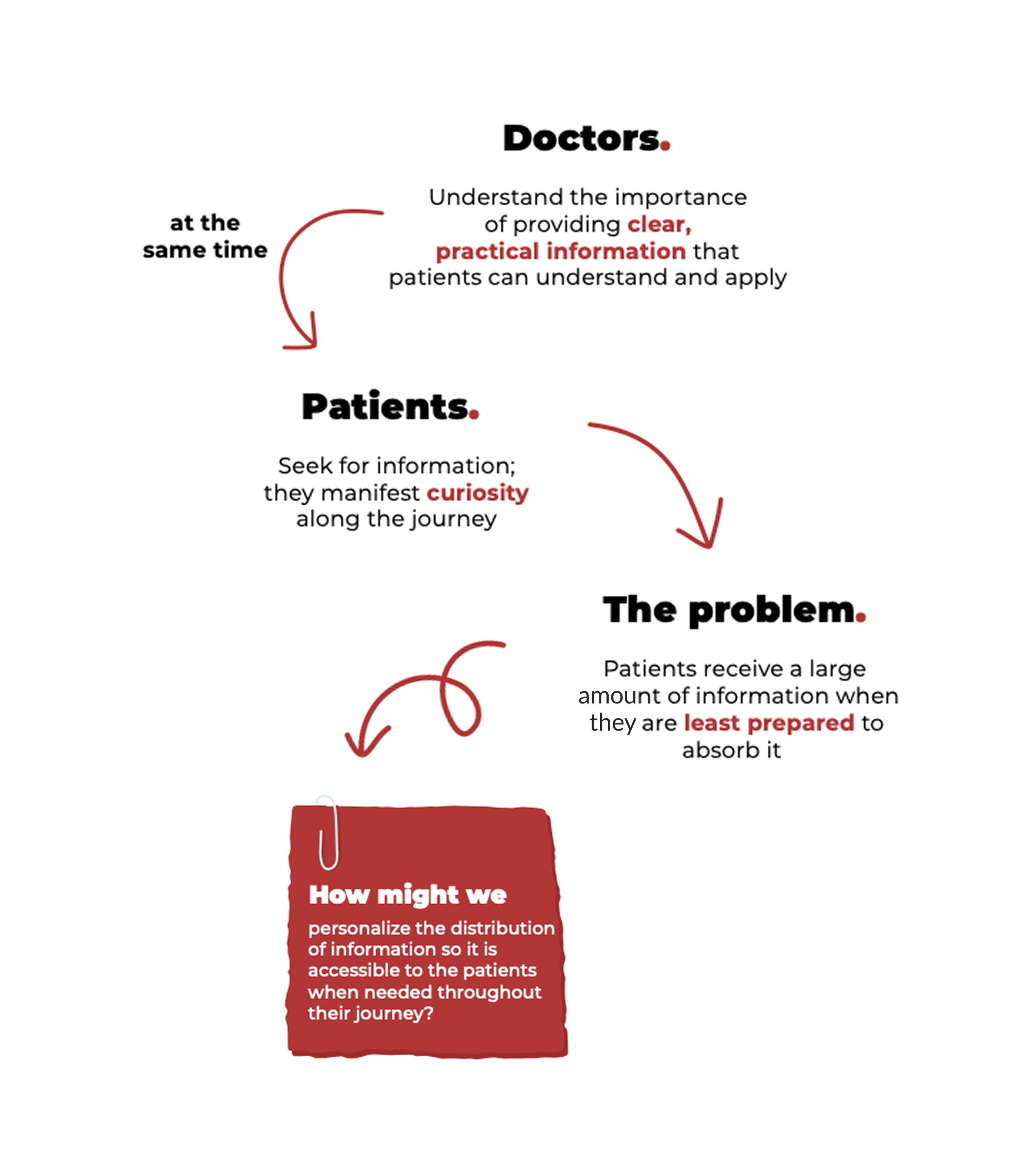
“How might we personalize the distribution of medical information so patients receive the right support at the right stage of their treatment journey?”
Working alongside Køge University Hospital and Charlie Tango, our team redesigned how information is delivered throughout the colorectal cancer pathway. Rather than overwhelming patients with extensive information during consultations, we developed a service that distributes personalised information progressively, helping patients better understand, remember, and actively participate in treatment decisions.
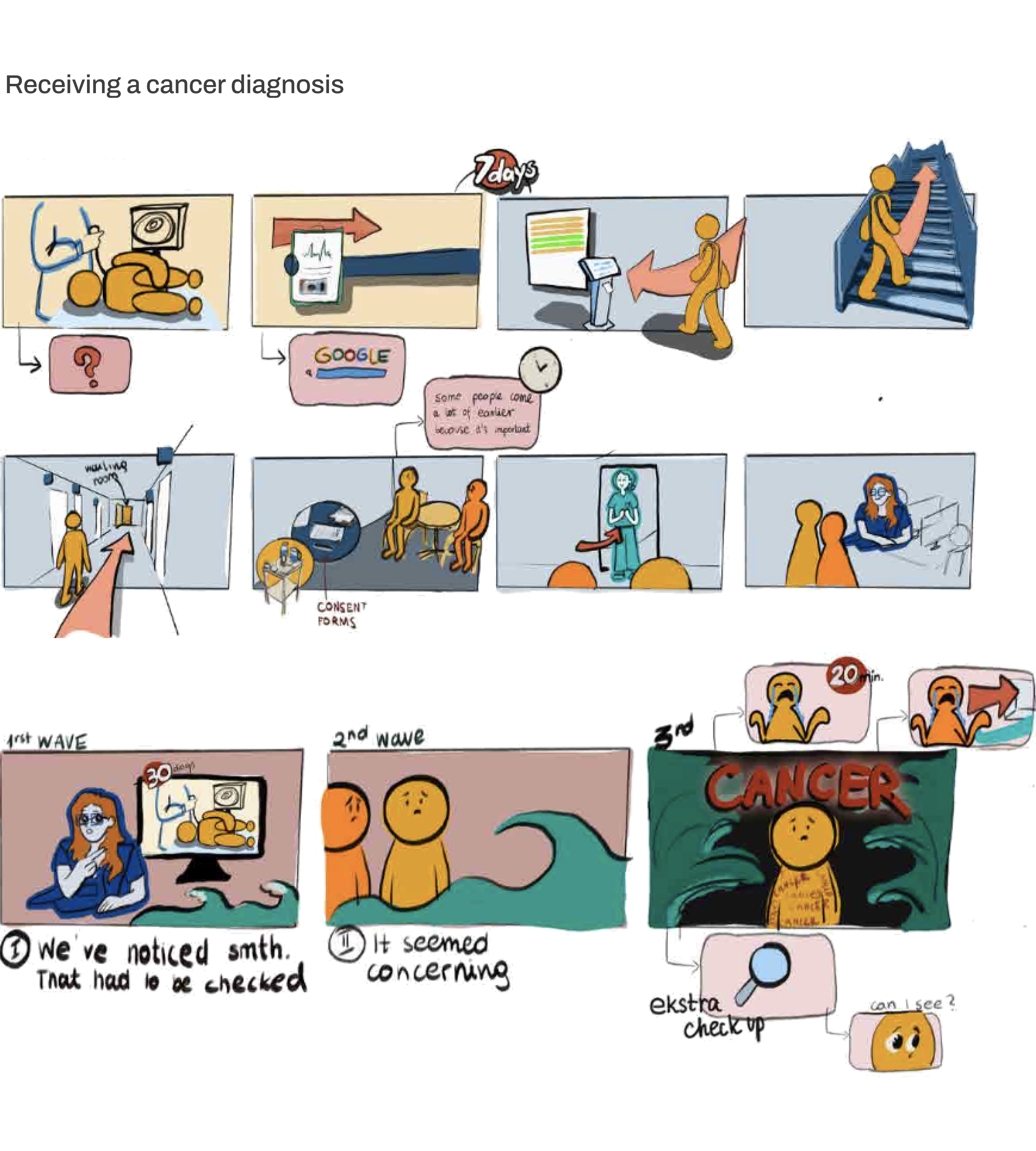
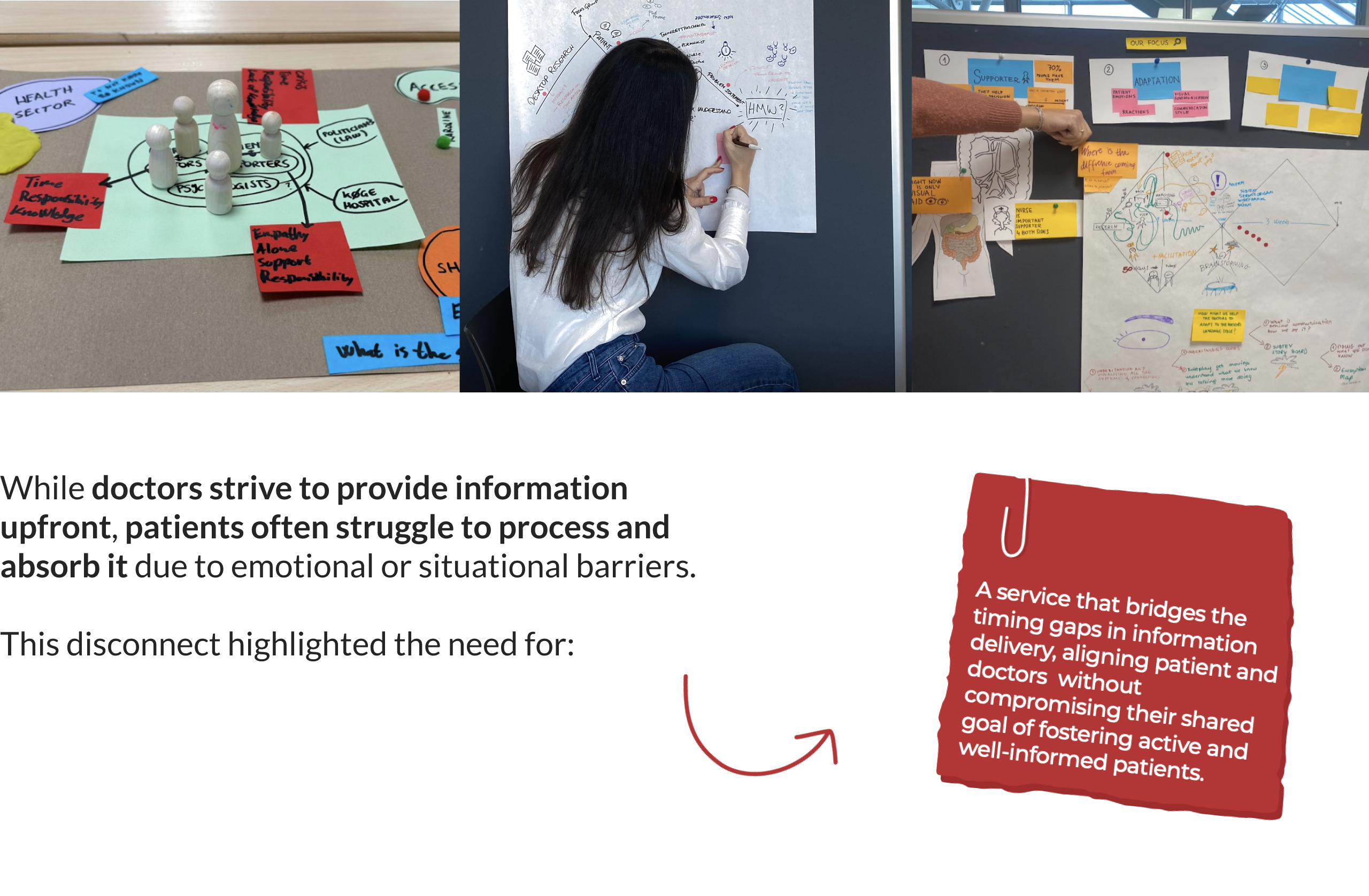
Patients received large amounts of complex information precisely when they were least prepared to absorb it. This created information overload, reduced participation in consultations, and made shared decision-making more difficult for both patients and healthcare professionals.
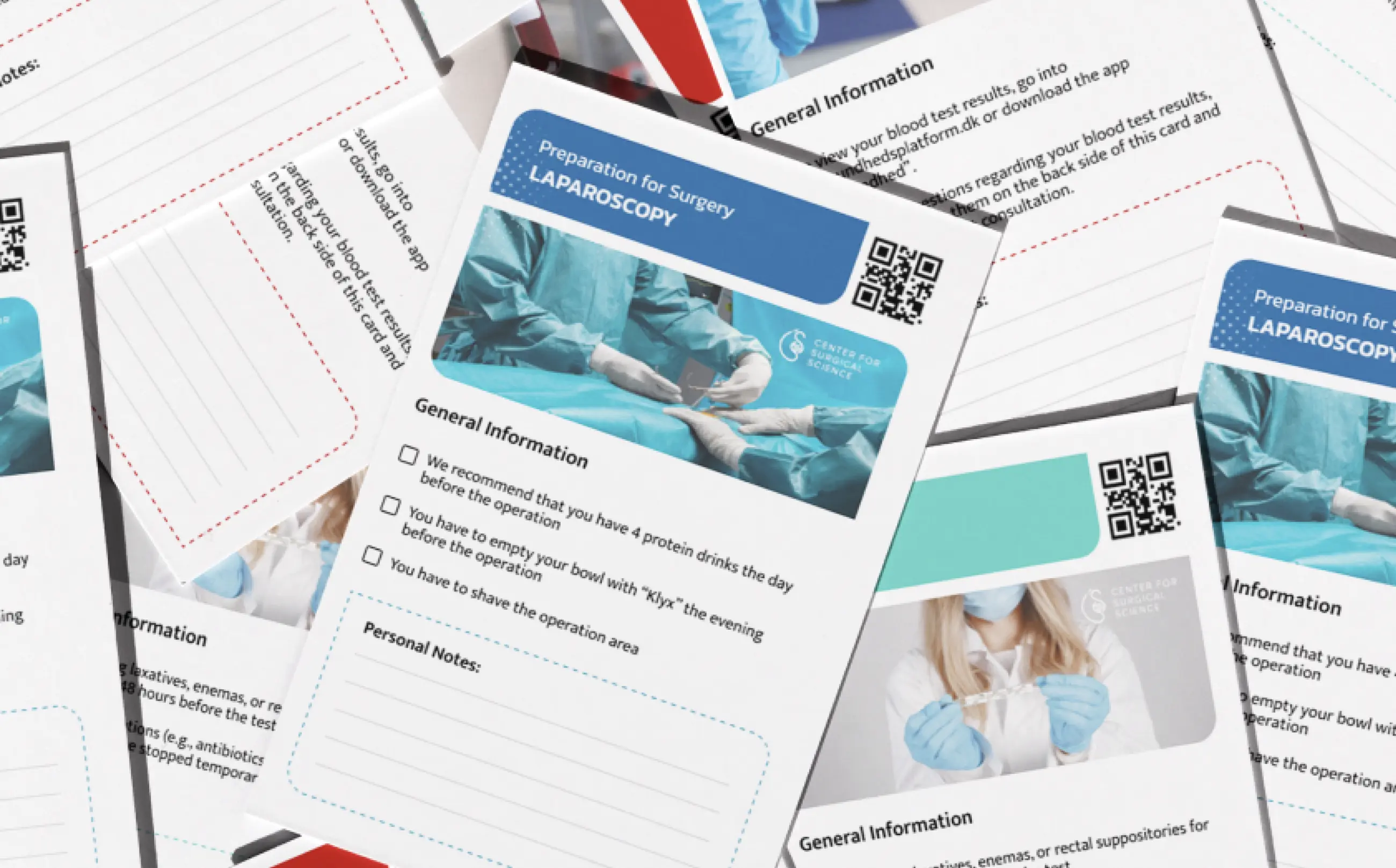
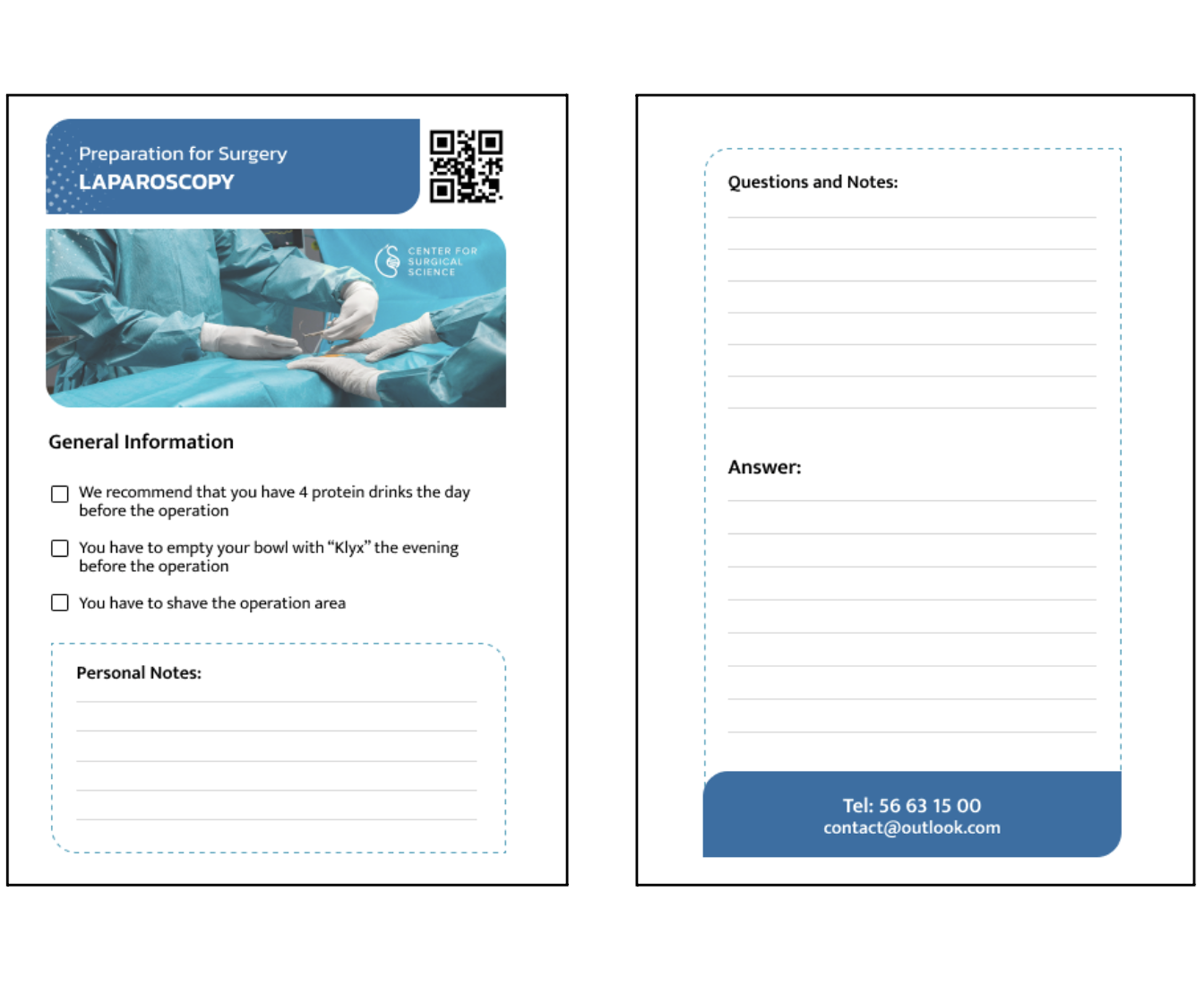
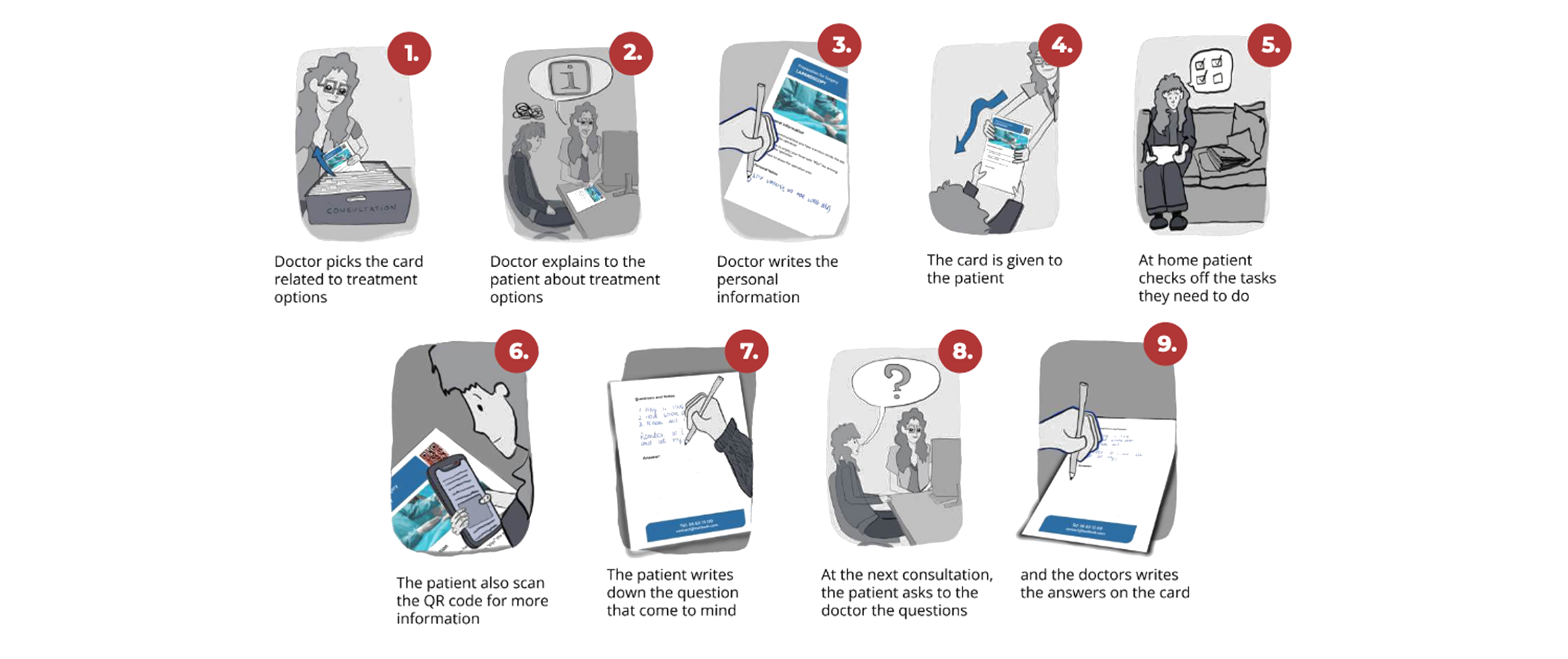
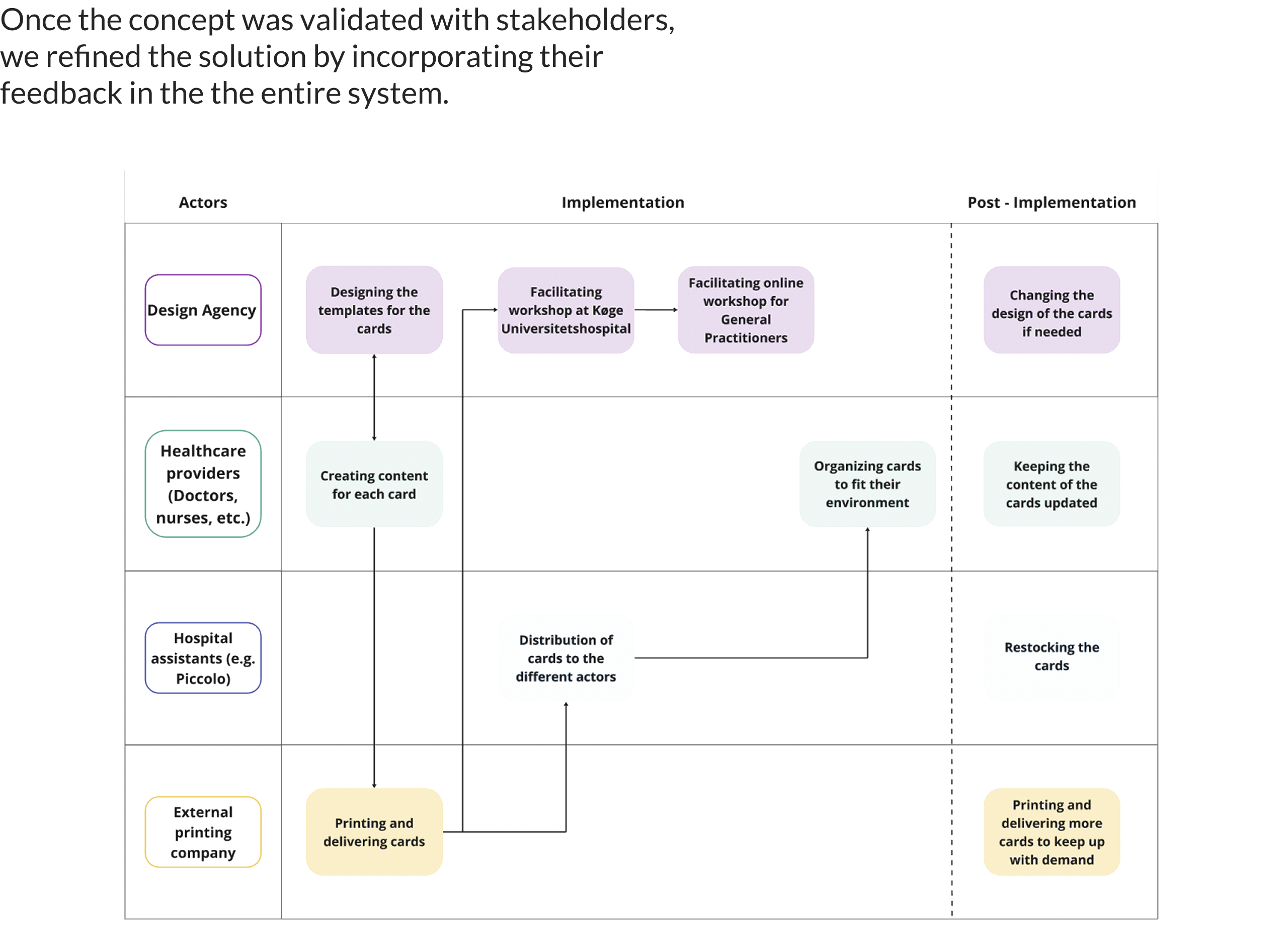
We designed a personalised card-based service that distributes relevant information throughout the patient’s healthcare journey instead of concentrating it within consultations. Each card combines practical guidance, personalised notes, reflective prompts, and QR-enabled digital content, creating an ongoing dialogue between patients and healthcare professionals. The service was supported by a digital dashboard and a service blueprint to facilitate implementation across the hospital ecosystem.
Informative cards that are distributed to patients throughout their cancer journey in between the several consultations. They provide only the relevant details, ensuring patients receive the information when they need it most,
at the right moment.
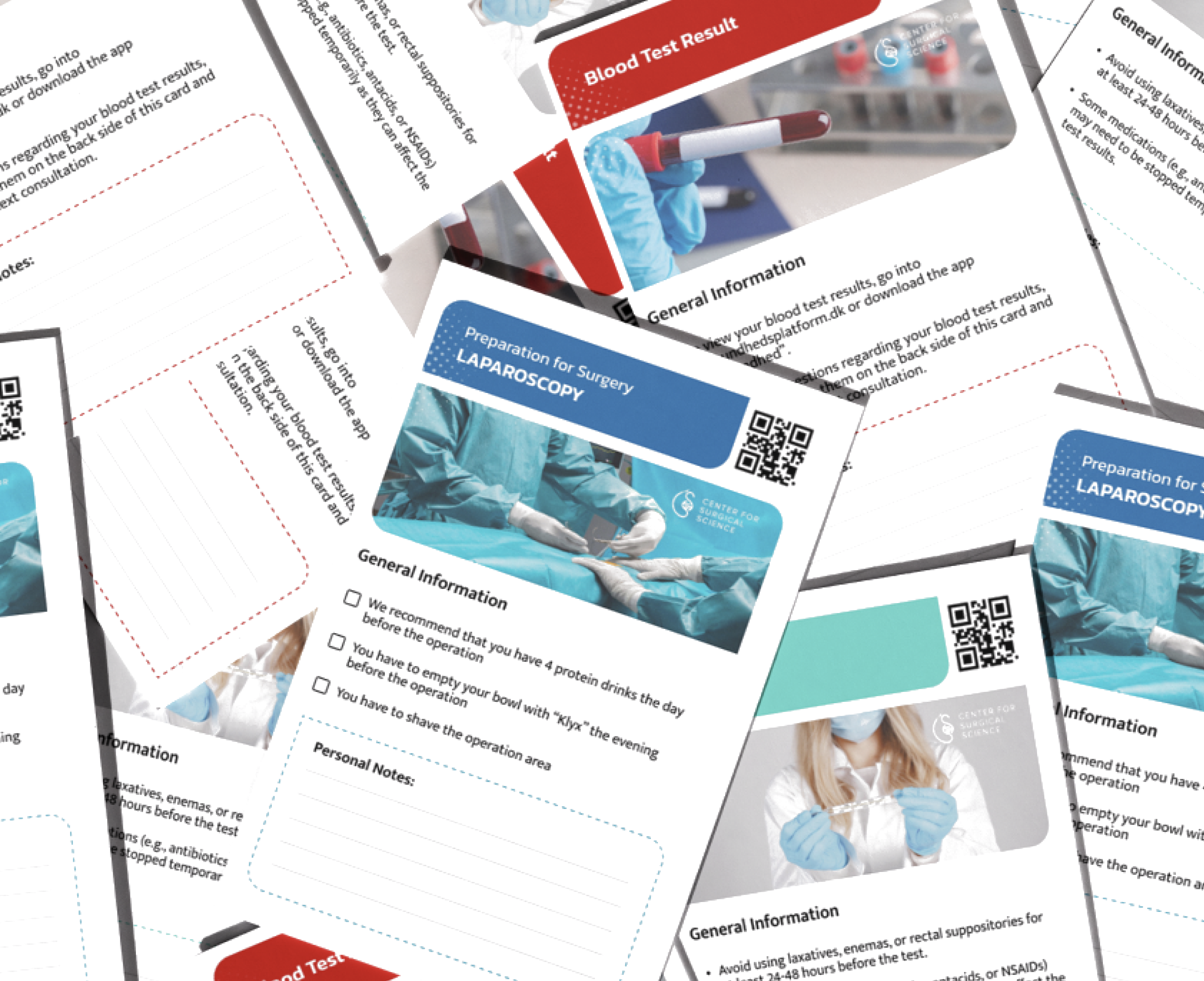
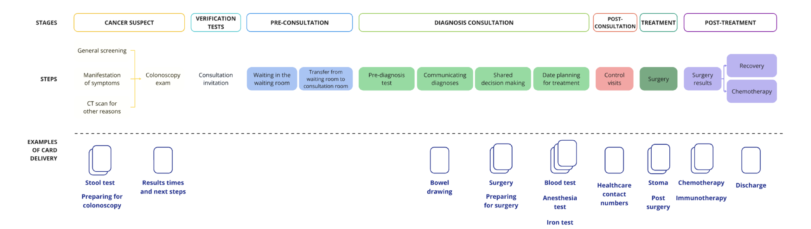
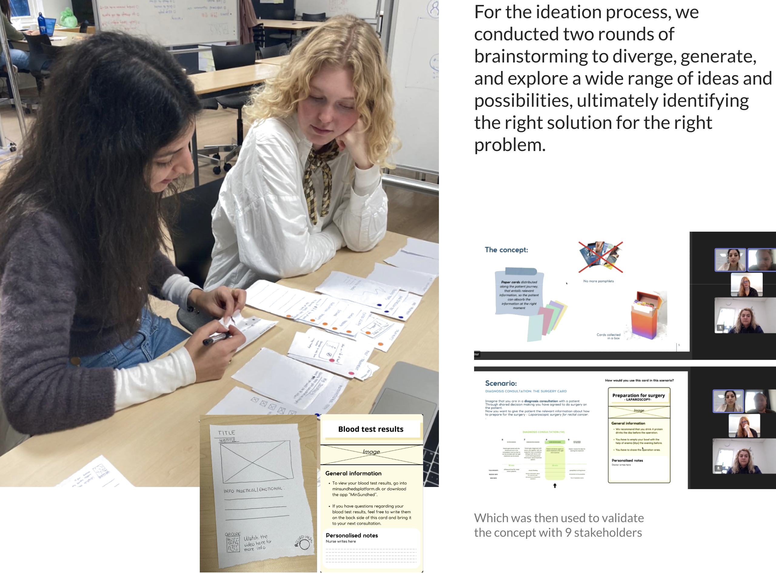

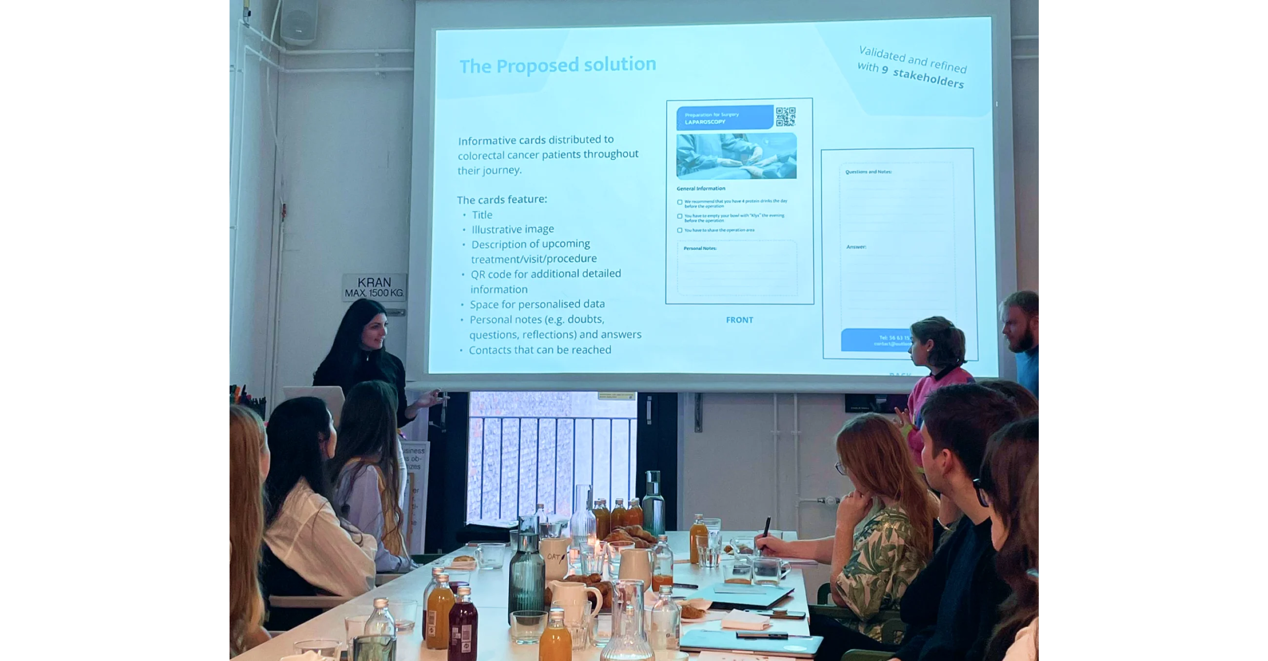
The concept was positively validated with healthcare professionals and patients, who recognised the value of receiving personalised information progressively rather than during a single consultation.
Beyond the card system itself, the project proposed a scalable service model that aligned patient needs with clinical workflows, demonstrating how service design can improve communication, support shared decision-making, and create more patient-centred healthcare experiences.
Designing a facilitation framework to align stakeholders and de-risk organisational transformation.
*Content redacted due to confidentiality.
Methods: Co-creation · Facilitation · Risk Mapping · Collaborative Prioritisation
“How might we introduce a new Delivery Office operating model while minimising implementation risk and building stakeholder alignment?”
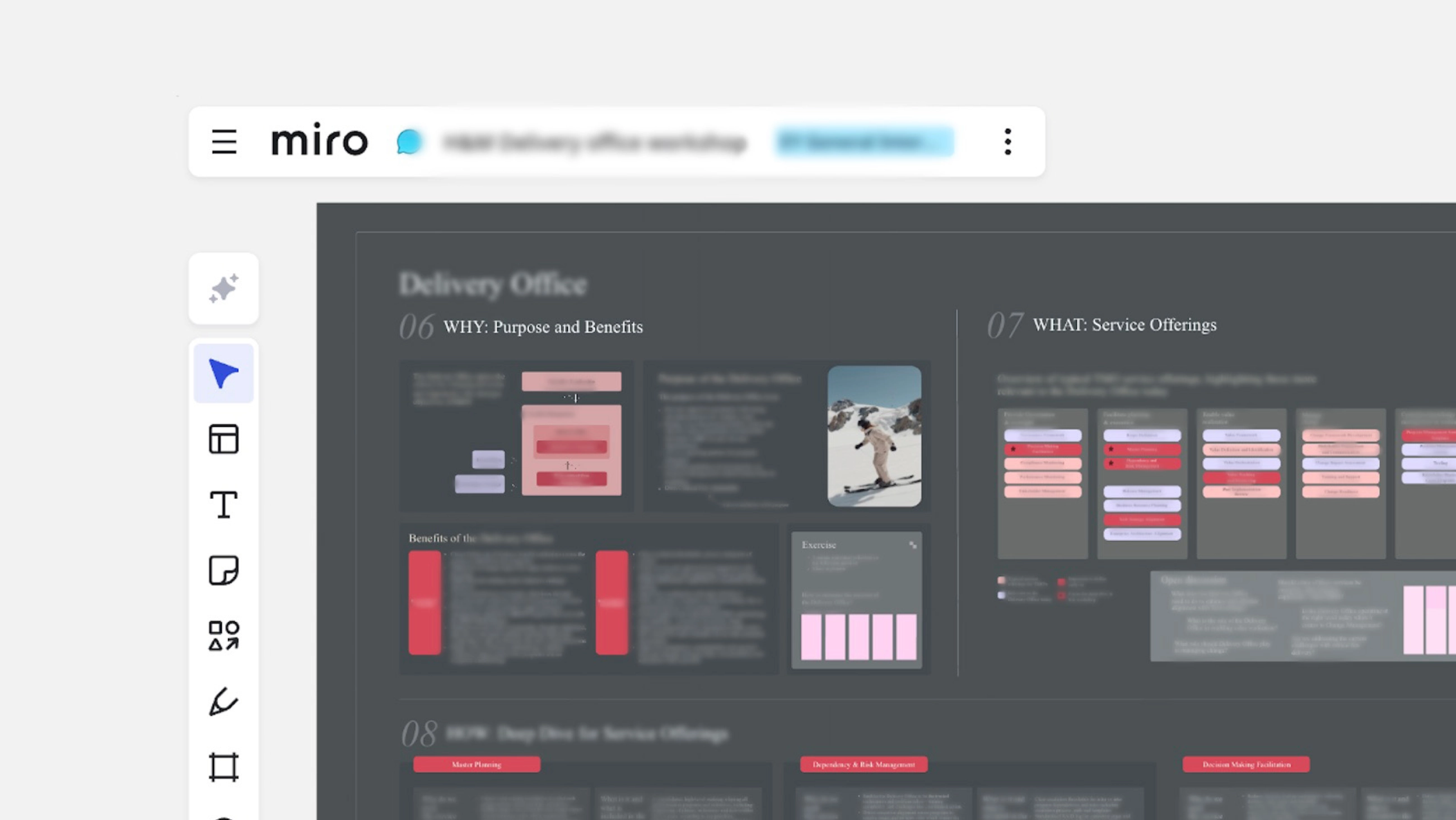
Working within a Big Four consultancy, I designed a strategic workshop to support the introduction of a new Delivery Office operating model for a global fashion retailer. The workshop translated a complex organisational initiative into a series of collaborative activities that enabled participants to understand the model, evaluate implementation scenarios, and align on practical next steps.
Introducing a new operating model requires more than defining processes, it requires stakeholders to understand its purpose, align on responsibilities, and collectively identify potential implementation risks before execution.
I designed an end-to-end facilitation experience in Miro that combined storytelling, best-practice references, collaborative exercises, and implementation planning. The workshop progressively guided participants from understanding the purpose of the Delivery Office to defining service offerings, responsibilities, governance, and practical implementation scenarios, encouraging discussion and collective decision-making throughout.
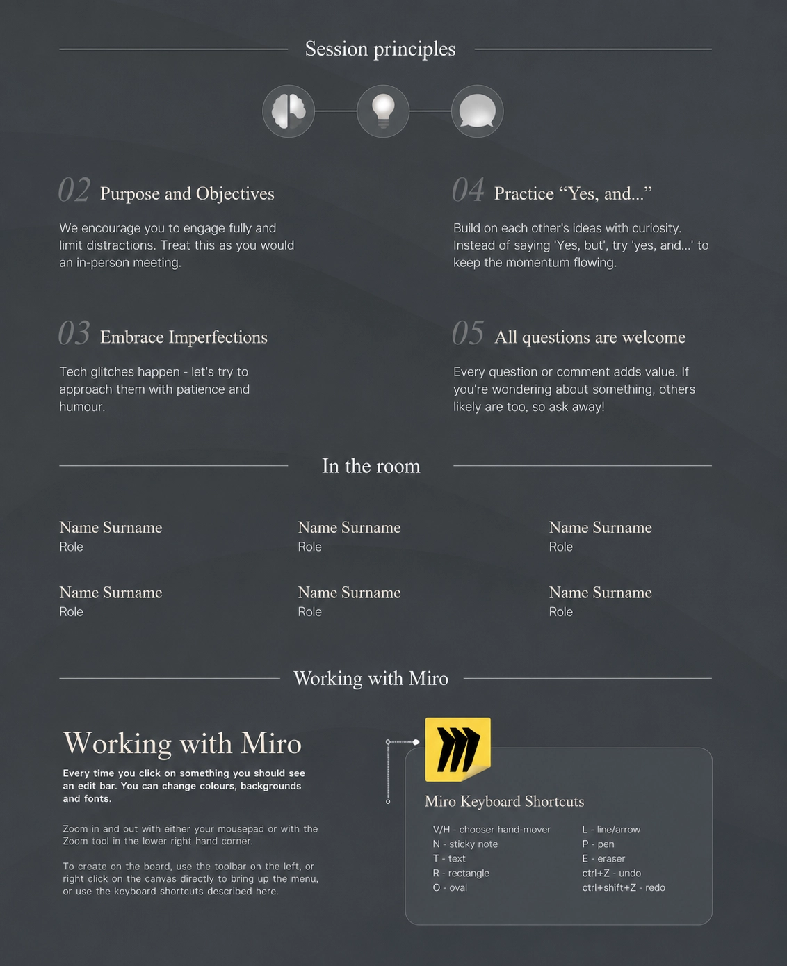
The workshop successfully aligned stakeholders around a shared understanding of the Delivery Office model and its implementation strategy.
The structured facilitation helped reduce uncertainty, encouraged constructive dialogue, and supported informed decision-making. The proposed approach was well received by the client and approved as the foundation for moving the transformation initiative forward.
“You really brought our concept to life through high-quality visuals and an effective workshop flow. Despite the very tight timeline, the result was impressive and received excellent feedback from the client, internal teams, and partners, particularly on the board’s look and feel. The workshop played a key role in securing the next phase of the programme.”The consultants account team
Jewellery e-commerce designed around self-expression and personal styling.
“How can an online jewellery experience help people express who they are?”
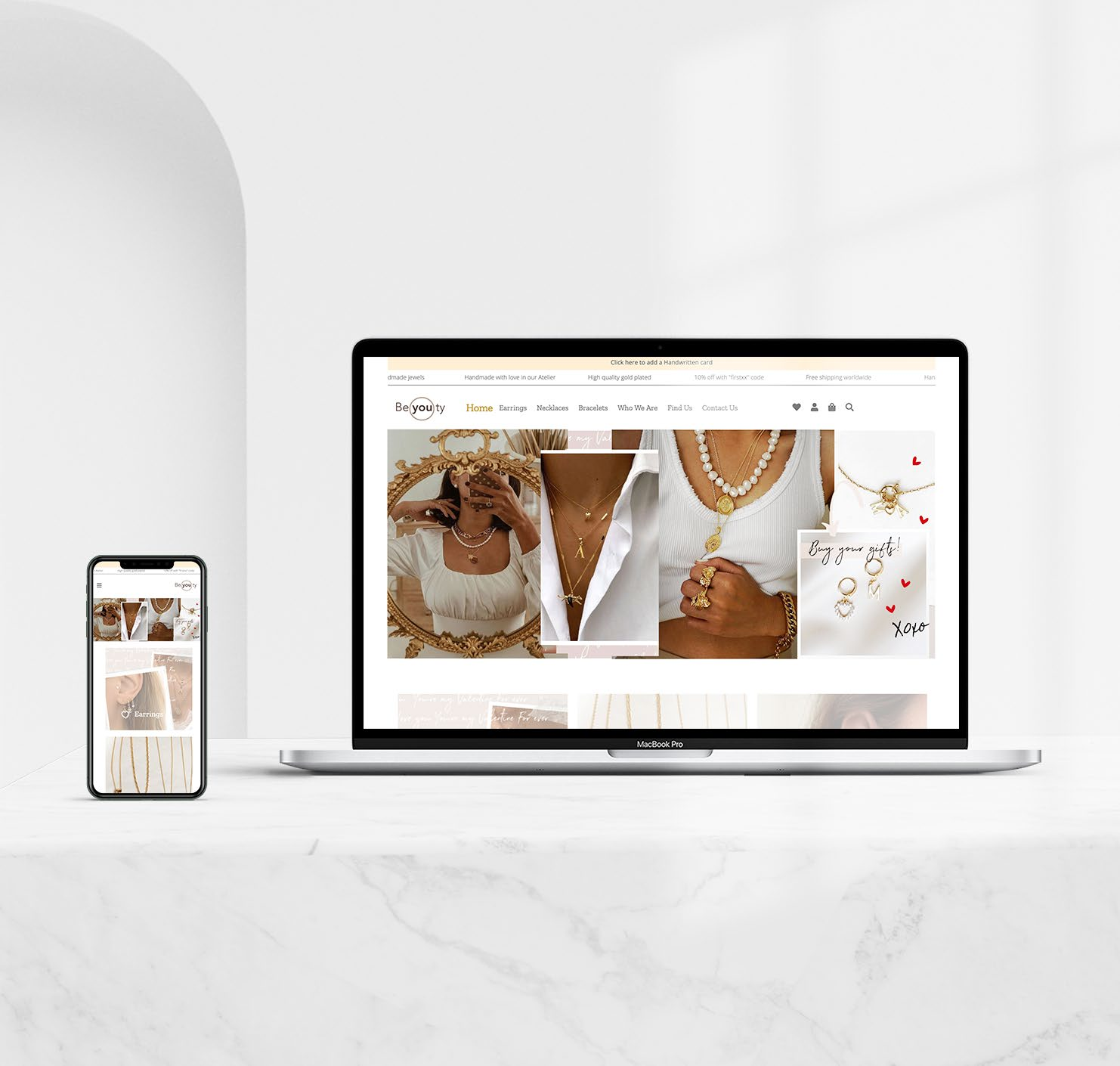
BE(YOU)TY is a conceptual jewellery brand and responsive e-commerce experience built around mixing, layering, and self-expression. The project translates the message “Show the world who you are” into a digital experience that helps customers explore individual pieces, discover new combinations, and imagine how each jewel could become part of their own style.
Jewellery websites often present products in isolation, making it difficult for customers to understand their sizes, and how different pieces can be combined and styled. The challenge was to communicate that each item is only a starting point, with no fixed rules for how it should be worn.
The website combines product discovery with styling inspiration, layered jewellery, and lifestyle imagery. On hover, individual product images transform into styled compositions, showing how each piece can be mixed with others. The visual identity balances Nordic minimalism with Mediterranean warmth through clean layouts, soft neutral tones, gold details, sunlight, and tactile summer imagery.
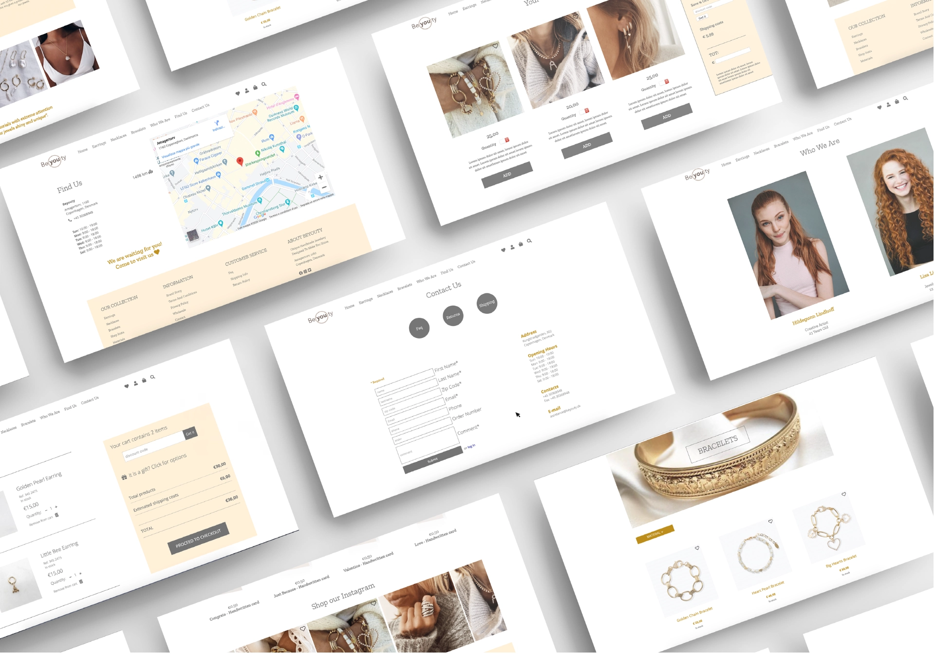
Beauty begins with being you
The name combines beauty and be you, expressing the idea that jewellery should not define one ideal, but give each person the freedom to create their own.
Nordic simplicity, Mediterranean warmth
Clean layouts and soft neutral tones are balanced by gold, sunlight, summer textures and sun-kissed imagery.
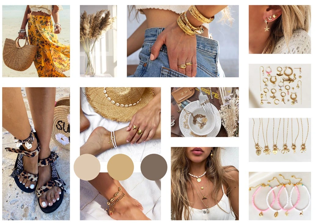
Cream, warm yellow, white and earthy brown reflect Scandinavian minimalism meeting summer warmth.
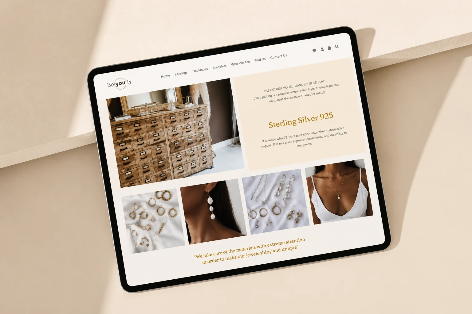
BE(YOU)TY resulted in a complete responsive e-commerce concept that translated one brand idea consistently across visual identity, interface and interaction.
The project helped me move beyond static brand design and understand how a visual identity behaves across a digital journey. The project strengthened my ability to design a visual identity as a dynamic system, using motion and interaction to communicate the mix-and-match concept.
Redesigning a dental knowledge platform to make complex information easier to navigate and understand.
“How might a content-heavy knowledge platform make complex information easier to find, scan, and understand?”
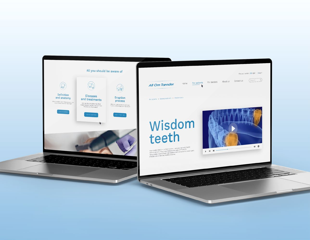
Alt Om Tænder is a Danish dental knowledge platform containing extensive information about oral health and treatment. The project focused on redesigning the wisdom teeth subpage, using information architecture and visual design to improve the clarity, usability, and structure of the experience.
The existing page presented users with dense content, unclear navigation, and limited visual hierarchy. The challenge was to simplify how the information was organised without reducing its depth, helping users quickly identify what was relevant while preserving the platform’s trustworthy and informative character.
Following a competitor analysis, I reorganised the content through keyword clustering and defined a clearer user flow. The redesigned page combines simplified navigation, structured content blocks, stronger hierarchy, white space, and carefully selected imagery, making the information easier to scan, understand, and explore.
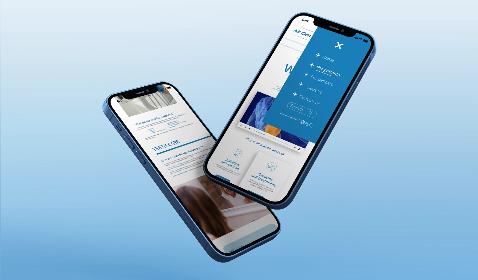
The project demonstrated how visual design and information architecture can work together to make complex content feel more accessible.
It strengthened my understanding that readability depends not only on typography and aesthetics, but also on how information is grouped, prioritised, and sequenced. The project also became an important professional milestone, attracting the attention of a Danish company and leading to a work opportunity.
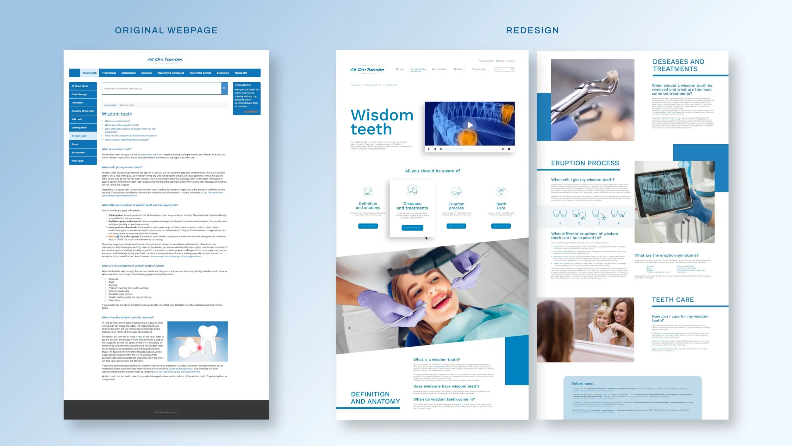
“The brief was to visually redesign one page, but Sofia went much further. Her overall and complete research, competitor analysis and careful content organisation demonstrated an impressive level of depth and accuracy.”Danish communication agency
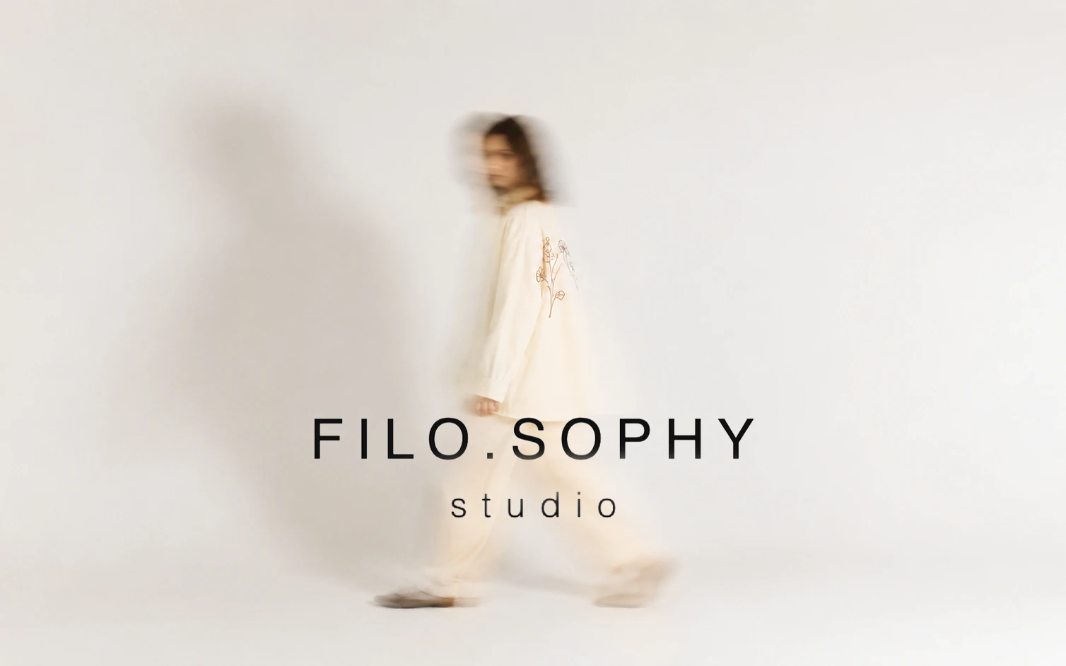
My illustration-led embroidery brand transforming personal ideas into wearable, handmade pieces.
“How might digital illustrations move beyond the screen and become meaningful, personal objects?”
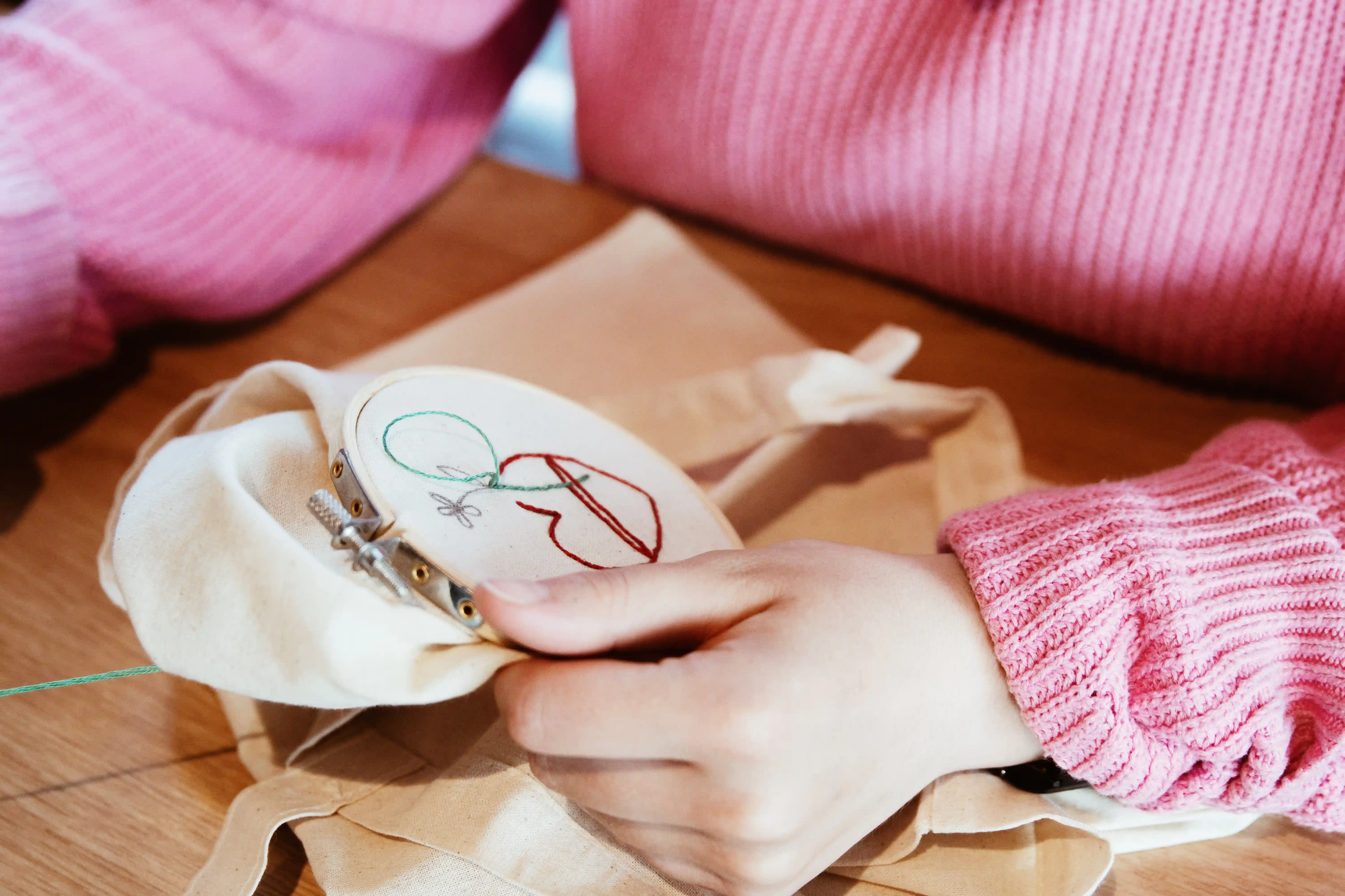
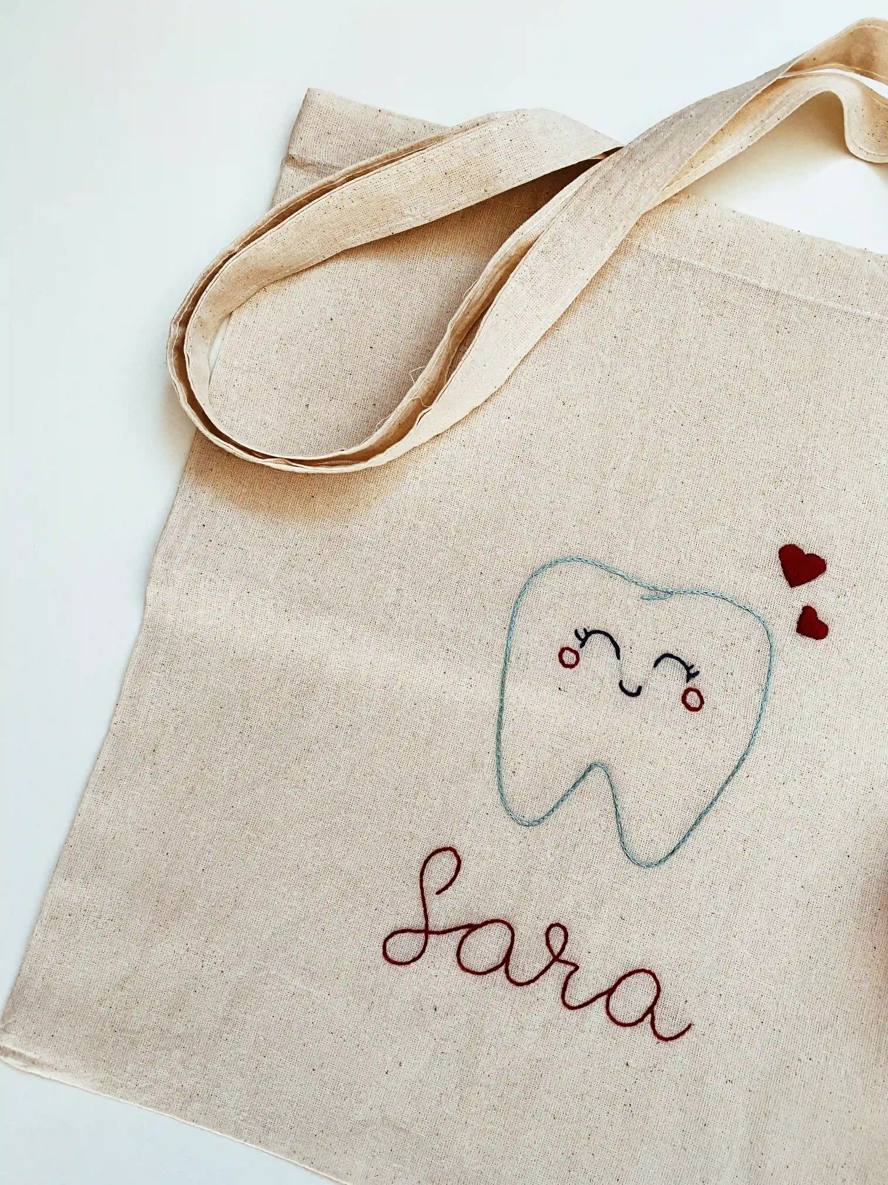
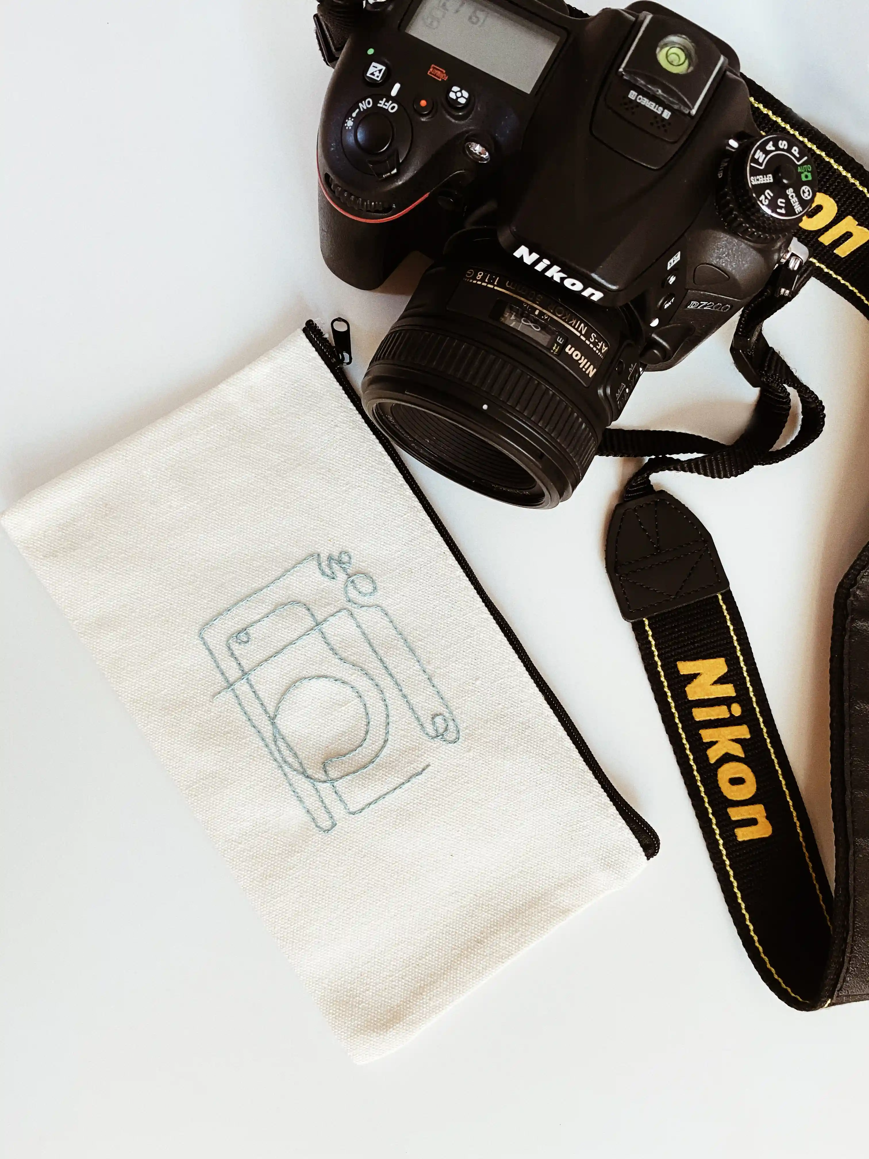
Filo.sophy Studio is a personal brand that transforms original digital illustrations into handmade embroidery on textiles and accessories. Each piece is developed collaboratively, from the customer’s initial idea to the illustration and final embroidery, creating a unique object shaped around their story and preferences.
The project began during the COVID-19 period, when I shared digital illustrations as mobile wallpapers and social media stories. The designs received strong engagement and repeated requests from people who wanted to use and own them. The challenge was to transform this interest into a tangible product and build a coherent creative brand around it.
I developed Filo.sophy Studio around the concept of wearable illustration. By translating digital artwork into embroidery, the illustrations became personal objects that people could wear, carry, customise, or give as gifts. This expanded the project beyond social media while preserving the individuality and handmade character of each design.
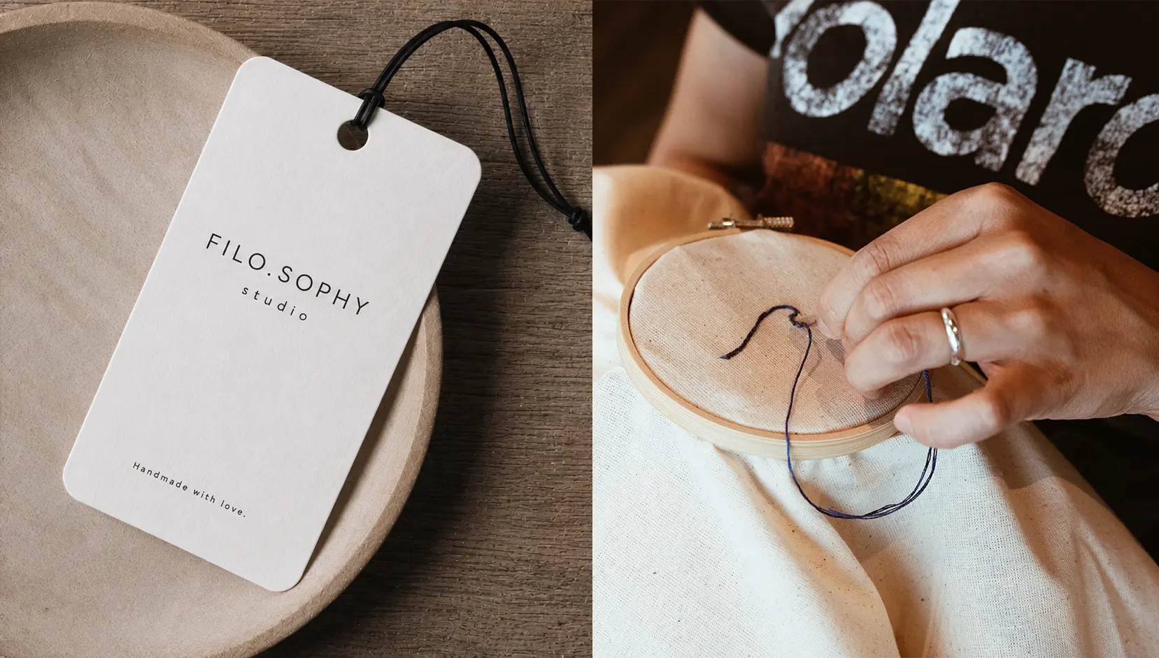
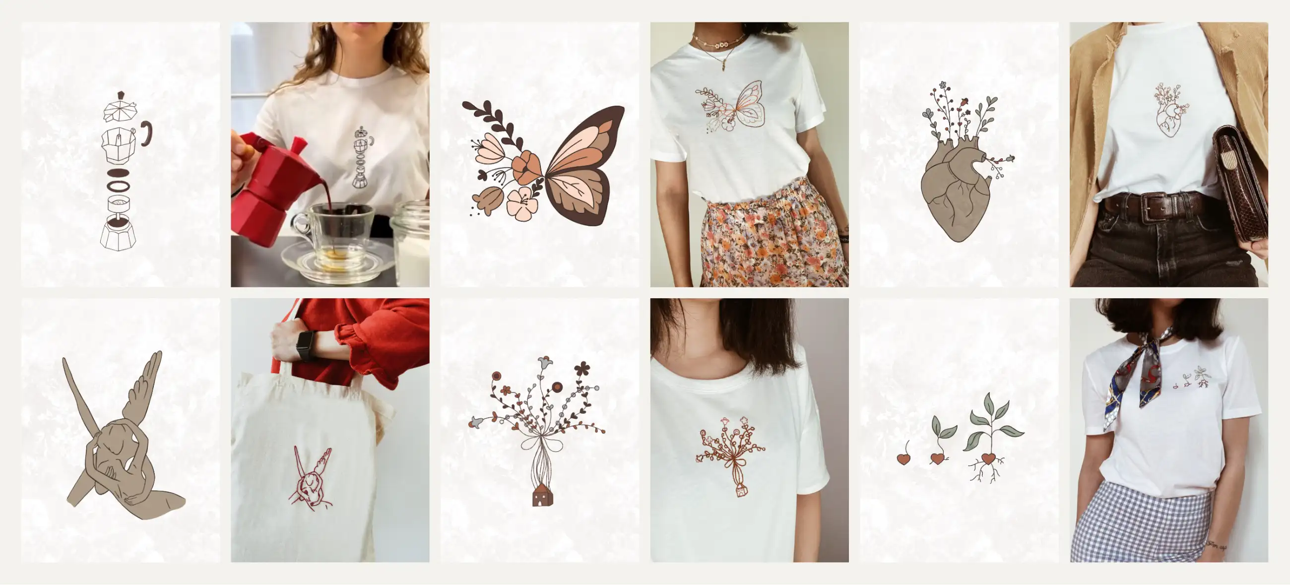
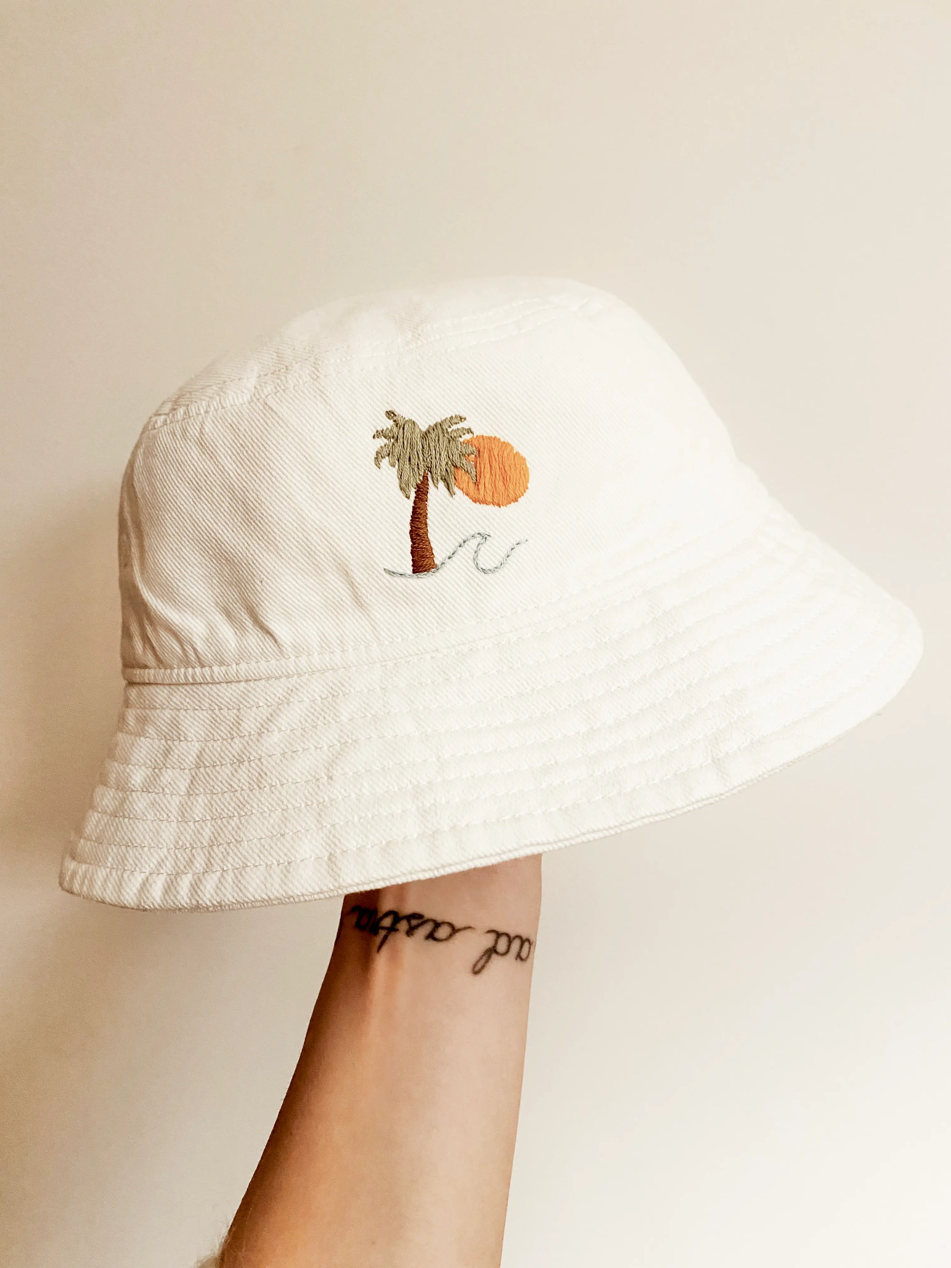
Filo.sophy Studio developed from an experimental illustration practice into a customer-facing creative brand.
The project received more than 30 orders in its first month and fulfilled over 290 purchases in Italy within its first year, growing mainly through organic social media engagement and customer recommendations. It later expanded into embroidery workshops in Copenhagen through the ArtXP community, allowing participants to design and create their own embroidered artwork.
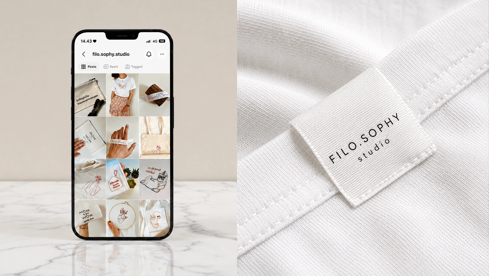
I am currently developing a new brand strategy to expand it in Denmark, adapting its positioning, visual identity and communication to a new market while maintaining the personal and handcrafted nature of the brand.
A circular packaging concept that turns cigarette waste into a resource for the surf community.
“How might packaging encourage kitesurfers to dispose of cigarette butts responsibly while supporting a more circular use of waste?”
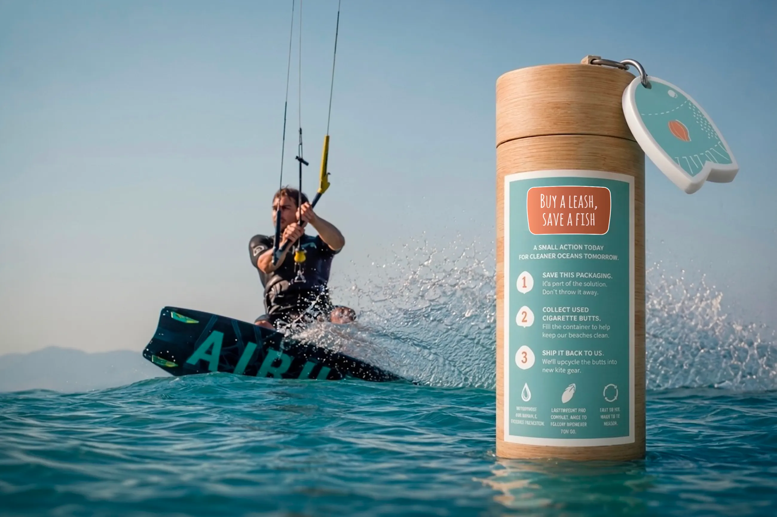
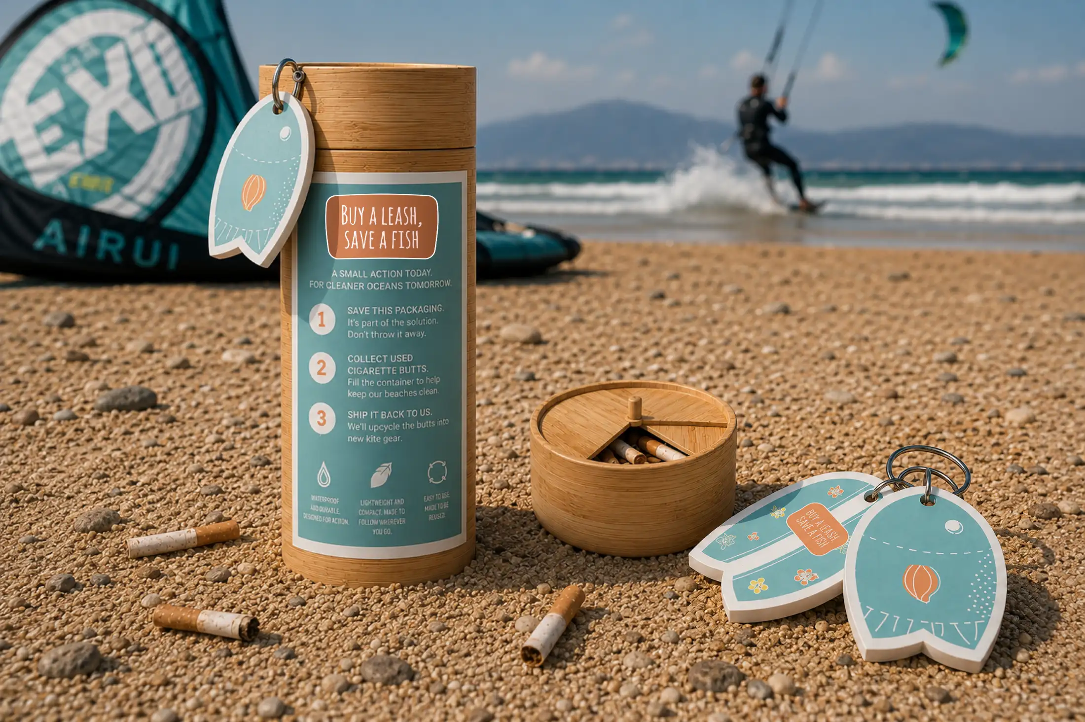
Buy a Leash, Save a Fish is a sustainable packaging concept designed for the kitesurfing community. The project transforms a standard leash package into a reusable cigarette butt container, combining product utility with environmental responsibility.
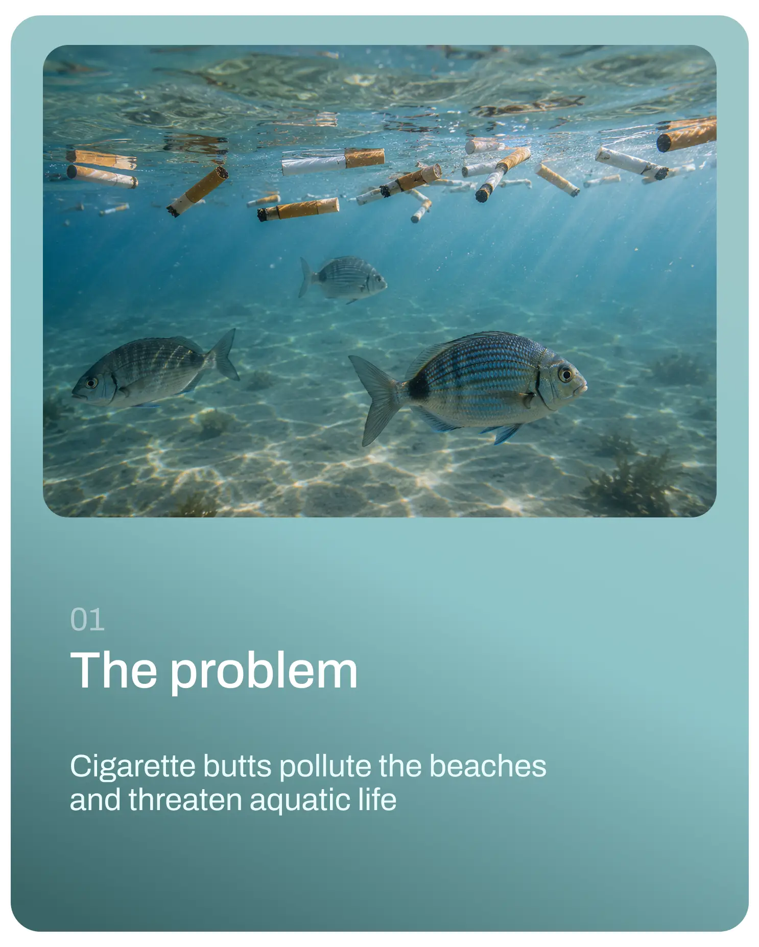
Cigarette butts are a common source of pollution on beaches and lakes, yet kitesurfers often lack a convenient way to dispose of them responsibly. The challenge was to make proper disposal easier while connecting the behaviour to a wider circular system.
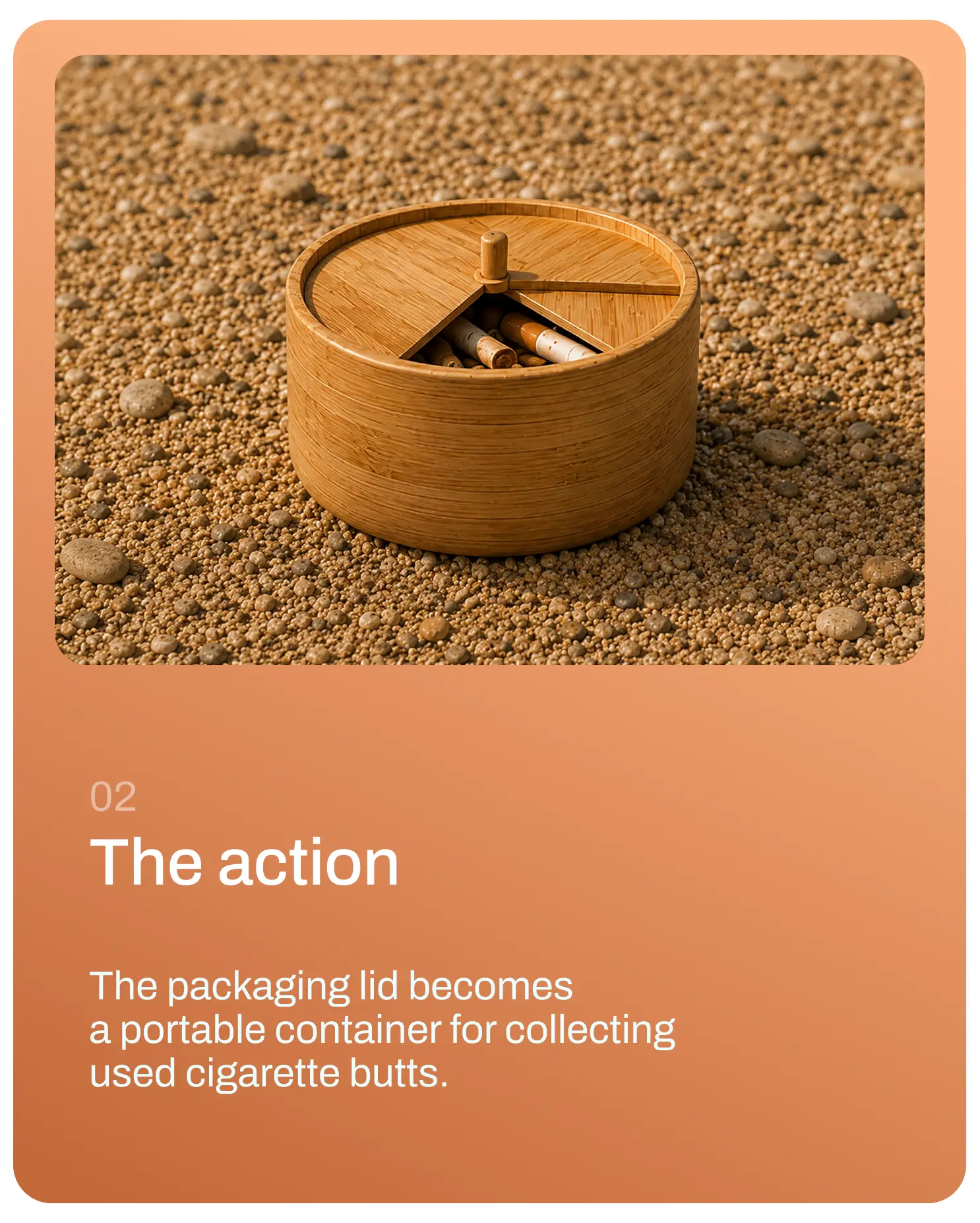
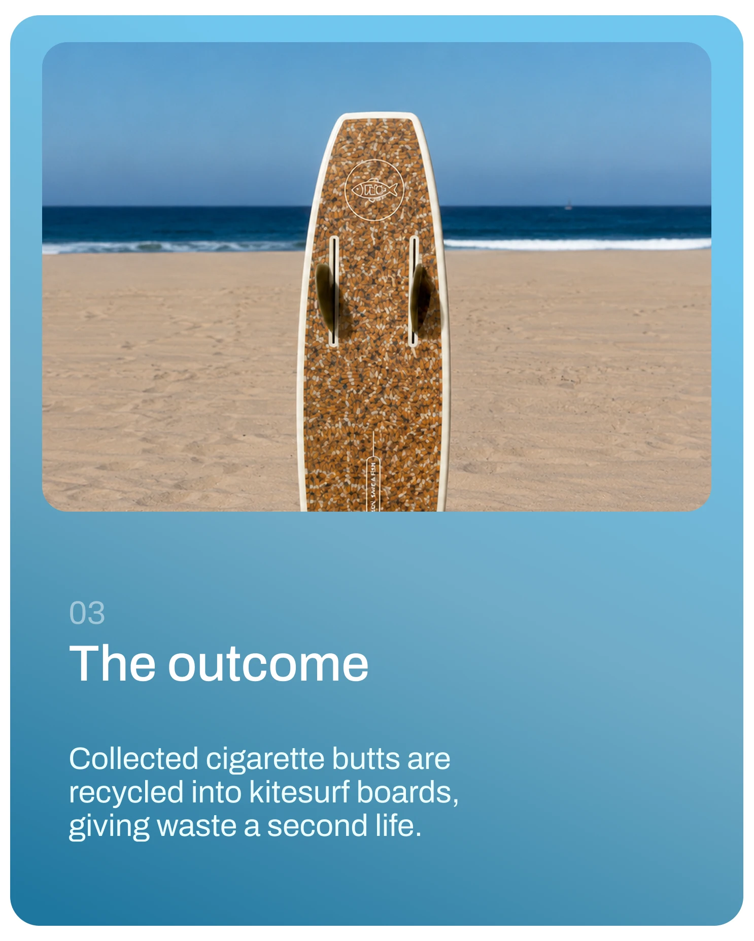
The concept uses a bamboo leash package with a removable cap that also functions as a portable cigarette butt container. Collected filters are recycled and repurposed into materials for eco-friendly surfboards, turning waste into a resource. The campaign message “Buy a Leash, Save a Fish” makes the environmental benefit immediate and memorable.
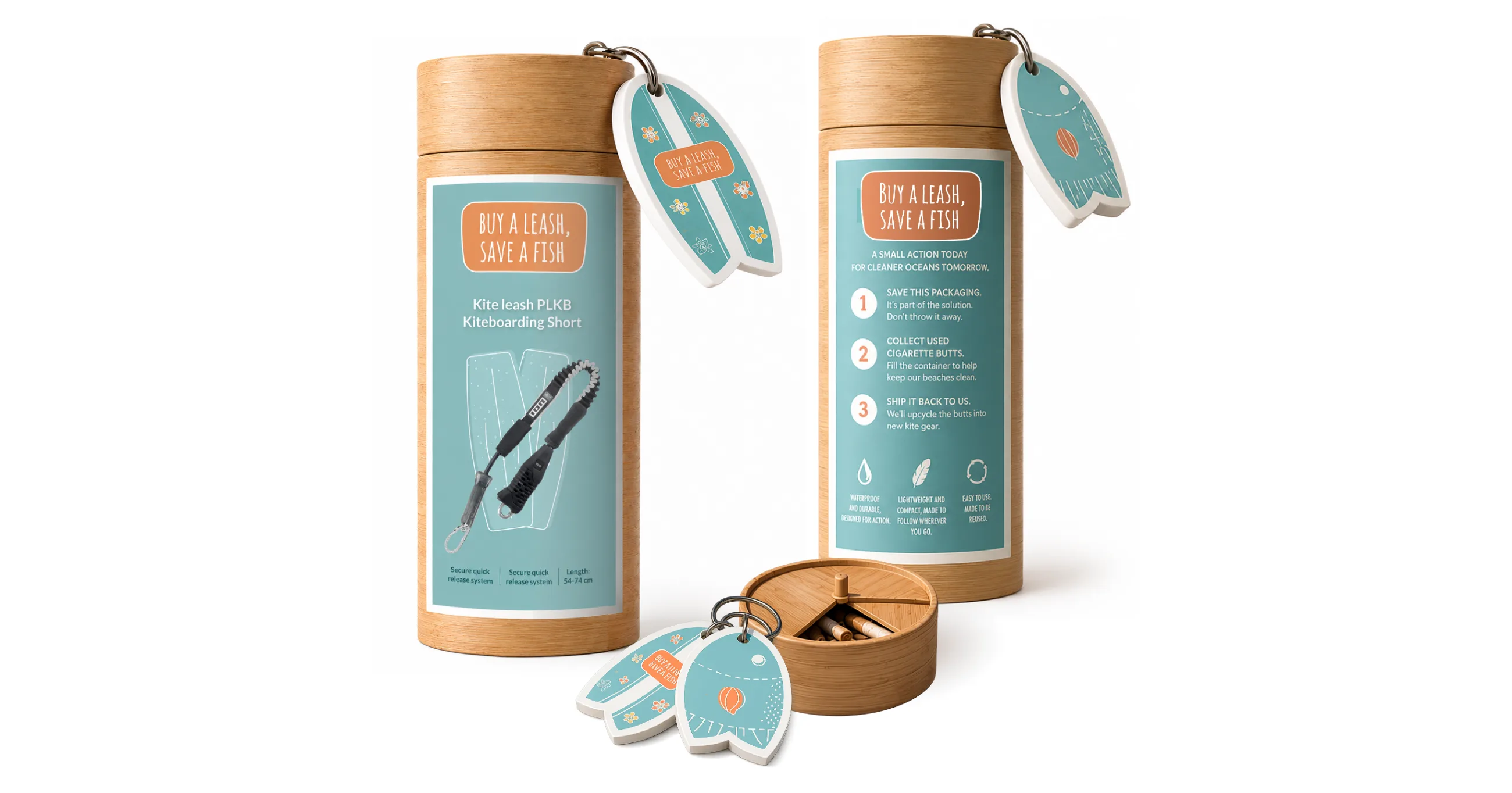


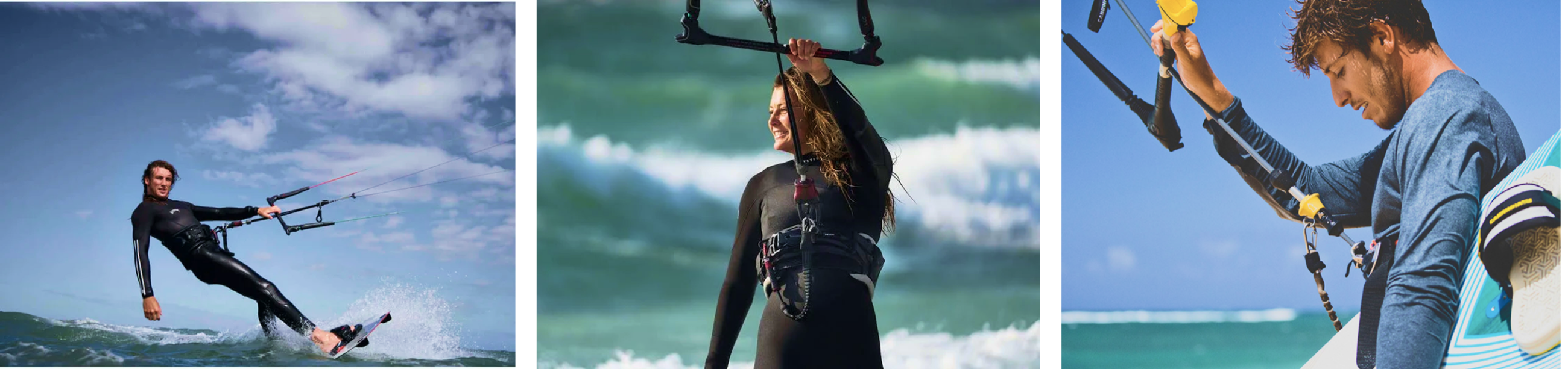
The leash keeps the rider connected to the kite
for greater safety and control.
Designing for behavioural change
The project explored how packaging can influence behaviour rather than simply contain a product. It strengthened my ability to connect product design, branding, material research, and circular thinking within one system, making responsible actions more intuitive while creating new value from waste.
A packaging concept that transforms solo travel into a mindful journey of self-discovery.
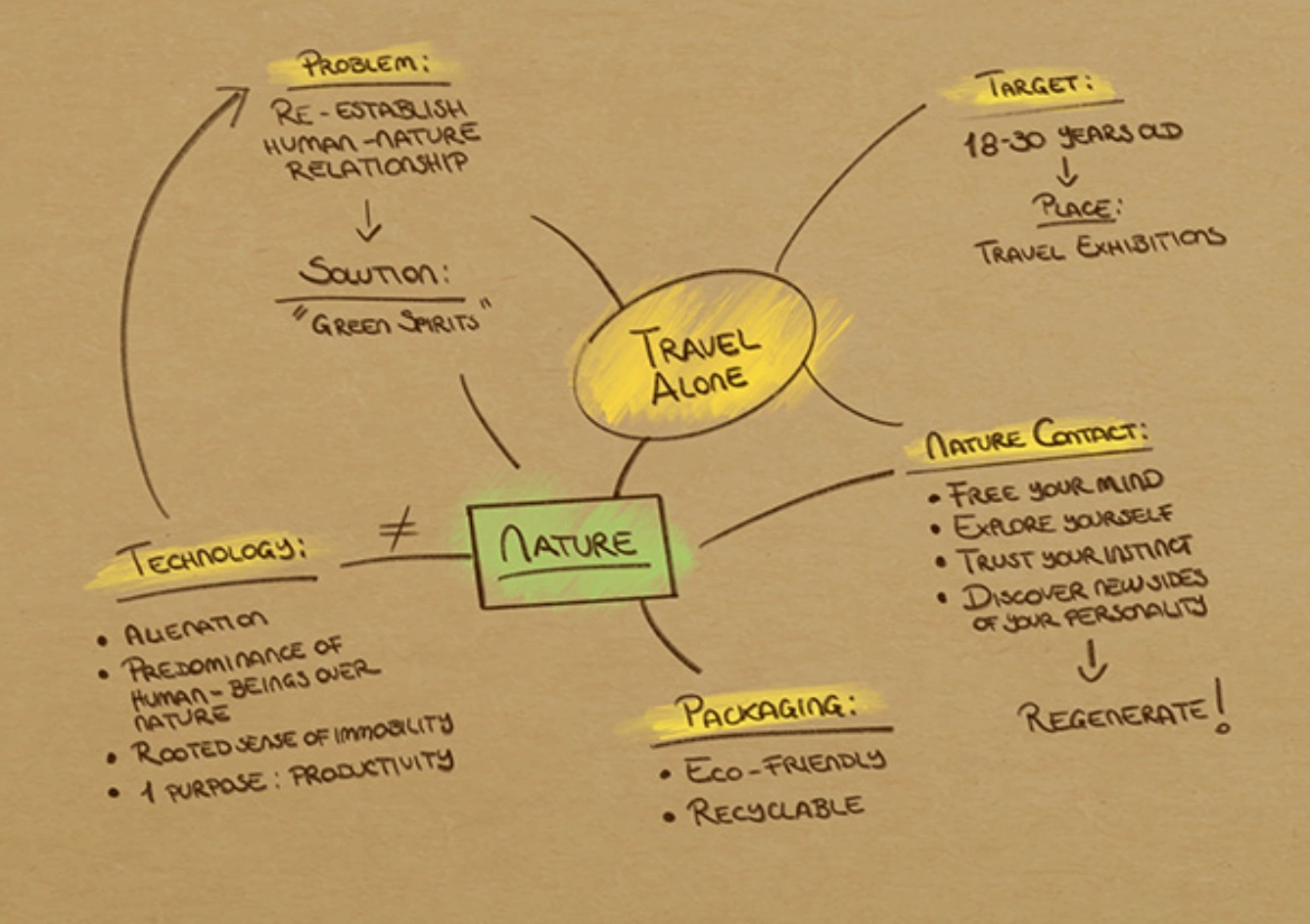
“How might packaging encourage young people to disconnect from technology, embrace solo travel, and reconnect with nature and themselves?”
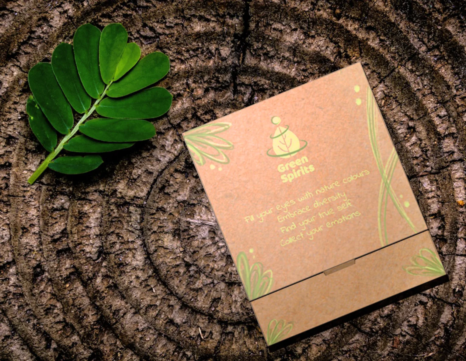
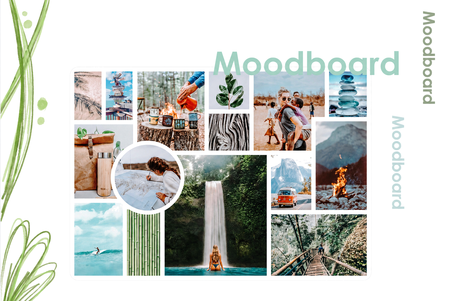
Green Spirits is a packaging concept designed to promote mindful solo travel. Rather than simply containing a product, the package accompanies travellers throughout their journey, encouraging them to collect memories, reflections, and personal discoveries before, during, and after the experience.
Technology, stress, and fast-paced routines often leave little space for reflection or meaningful connection with nature. The challenge was to design a tangible experience that could inspire young people to slow down, embrace solitude, and become more aware of both their surroundings and themselves.
Inspired by the Japanese practice of Shinrin-yoku (forest bathing), the package supports both reflection and sensory discovery: one side contains a diary for recording thoughts and experiences, while the other features pockets for collecting tactile memories from the journey. Distributed through tourism fairs and travel events, it supports travellers throughout their journey while encouraging a multisensory connection with nature.
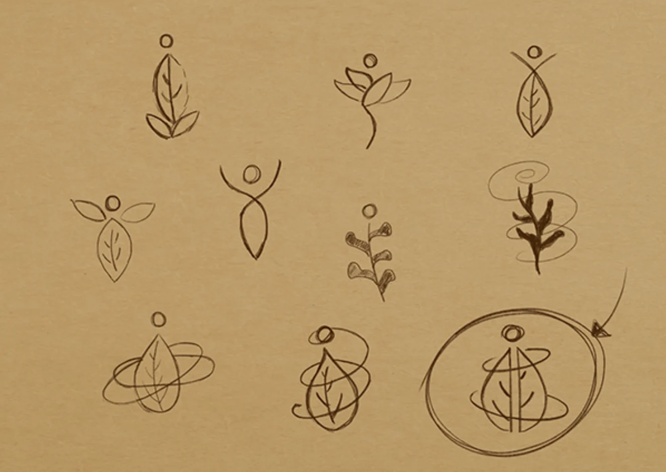
The logo translates Green Spirits' values into a simple visual symbol, combining nature, personal growth and the idea of a transformative journey.

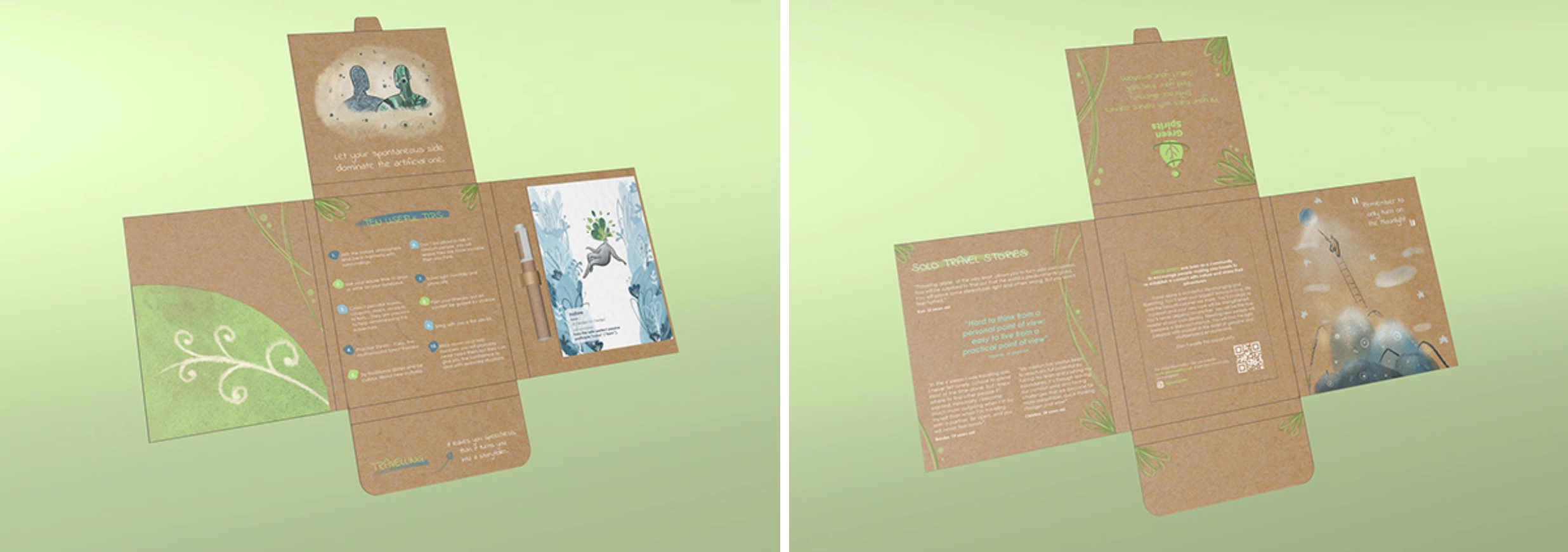
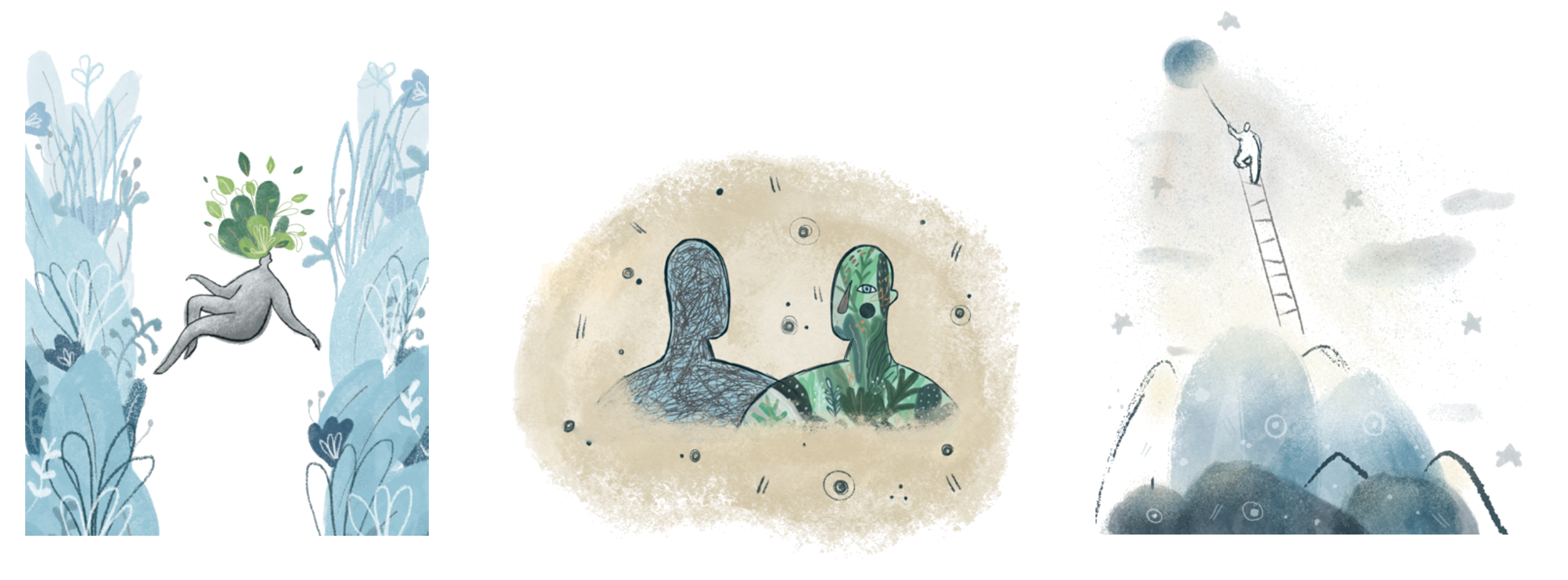
01 – Moonlight
A visual reminder to slow down and reconnect with nature, celebrating the beauty and stillness often lost in everyday life.
02 – The Green Man
Contrasting alienation with self-discovery, this illustration represents the transformation from disconnection to a more authentic and flourishing self.
03 – Immersion in Nature
A metaphor for embracing the natural world, encouraging travellers to reconnect with their most instinctive and genuine selves.
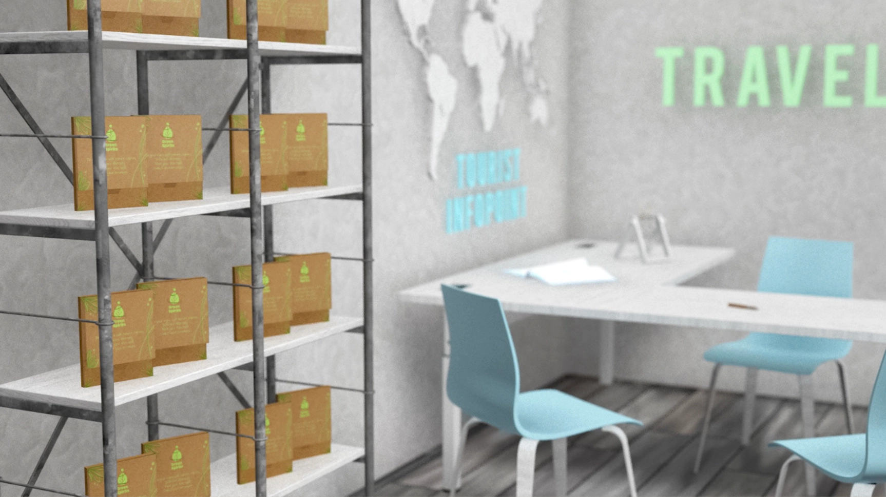
The project explored how packaging can become part of an experience rather than simply contain a product. It strengthened my ability to translate abstract emotions into tangible design solutions by combining illustration, storytelling, branding, and physical interaction into one cohesive experience.